Objectives
This second part of the introduction to ordinations focuses on showing a priori groups and environmental gradients in ordination graphics and testing them with vegan functions.
- Categorical variables:
- Fit and plot groups with
ordihull,ordiellipse, andordispider - Test groups with
envfitandRVAideMemoire
- Fit and plot groups with
- Continuous variables (environmental gradients)
- Fit, plot, and test vectors with
envfit - Fit, plot, and test non-linear response surfaces with
ordisurf
- Fit, plot, and test vectors with
Walking through the script
Packages and data
pacman::p_load(tidyverse, vegan, RVAideMemoire)
data("varechem")
chem_s <- select(varechem, N:Mo) %>%
            scale()
Fit Principal Components Analysis via capscale as an unconstrained ordination based on the Euclidean distance measure.1
This is the same ordination on scaled data as worked through in Lesson 11.2.1.
chem_pca <- capscale(chem_s ~ 1, method = "euc")First one must have some additional information about each of the observations. Such information often relates to management history, treatments, or known environmental gradients.
These data follow the same classification as other data–categorical or continuous–which represent groups and gradients, respectively. Each type of data are plotted and treated differently, much as how boxplots and ANOVA are used on when univariate analyses have categorical predictor variables while scatterplots and linear regression are used for continuous variables.
For this lesson, I simply made up some arbitrary groups for the varechem data.
Load them here from GitHub, but remember they don’t mean anything in terms of interpreting the data.
man <- read_csv("https://github.com/devanmcg/IntroRangeR/raw/master/data/VareExample/Management.csv")
man
## # A tibble: 24 x 6
## SampleID Pasture Treatment PastureName BurnSeason BareSoil
## <chr> <dbl> <dbl> <chr> <chr> <chr>
## 1 1.1.1 1 1 North Spring 42.5, 43.1, 43.9
## 2 2.2.1 2 2 South Summer 22.4, 23.9, 23.6
## 3 2.2.2 2 2 South Summer 20.2, 22.4, 21.2
## 4 2.2.3 2 2 South Summer 18.0, 18.7
## 5 2.2.4 2 2 South Summer 45.6, 47.2, 46
## 6 2.2.5 2 2 South Summer 39.4, 36.1, 40.5
## 7 2.2.6 2 2 South Summer 22.3, 24.1, 23.0
## 8 2.2.7 2 2 South Summer 29.1, 29.8
## 9 2.2.8 2 2 South Summer 17.4, 18.2, 17.6
## 10 1.1.2 1 1 North Spring 28.1, 30.4, 29.9
## # ... with 14 more rowsPlot by known groups
vegan gives us several options (ordi* functions) to identify site scores by a priori groups.
We used ordicluster in the previous lesson to connect site scores by their branches in the dendrogram fit by hclust.
ordi* functions ‘know’ how to handle ordination objects created by any of the vegan functions; these objects are named as the first argument.
The next argument is typically the vector in which the group or gradient data are stored, often using the df$column convention.
Many times the functions have options for displaying site scores or species scores, turning automatic labels on or off, and other base graphics arguments like color and line width options found in ?par.
Prior to identifying sites by a group, must first fill an empty plot with the site scores alone, then call the ordi* function of choice.
It requires an existing plot.
Three important ordi* functions include:
ordihull
Convex hulls are polygons created by connecting the outermost site scores of a group.
  plot(chem_pca, type="n", las=1)
  text(chem_pca, display = "sites",
       labels=row.names(chem_s))
  ordihull(chem_pca, man$BurnSeason, display="sites", label=T,
              lwd=2, col=c("blue","orange", "black"))
The plot shows three overlapping polygons that define the maximum area of each group’s site scores in the two-dimensional ordination space. The hulls are fit to the raw data as they appear in the plot, which creates angular polygons.
The less overlap between two hulls, the more dissimilar those groups are. Conversely, overlapping hulls are less dissimilar (more similar) in terms of the multivariate data used to create the ordination.
ordiellipse
Ellipses are less angular means of enveloping site scores into group-level polygons.
When kind='ehull', the ellipse is simply a rounded version of the convex hulls, attempting to pass through the outermost site scores of the group.
These smoothed curves can be more aesthetically pleasing, but the curves do at least slightly inflate the area covered by each group, which might make overlap appear greater than with the basic hulls.
  plot(chem_pca, type="n", las=1)
  text(chem_pca, display = "sites",
       labels=row.names(chem_s))
  ordiellipse(chem_pca, man$BurnSeason, display="sites",
            kind = "ehull", label=T,
            lwd=2, col=c("blue","orange", "black"))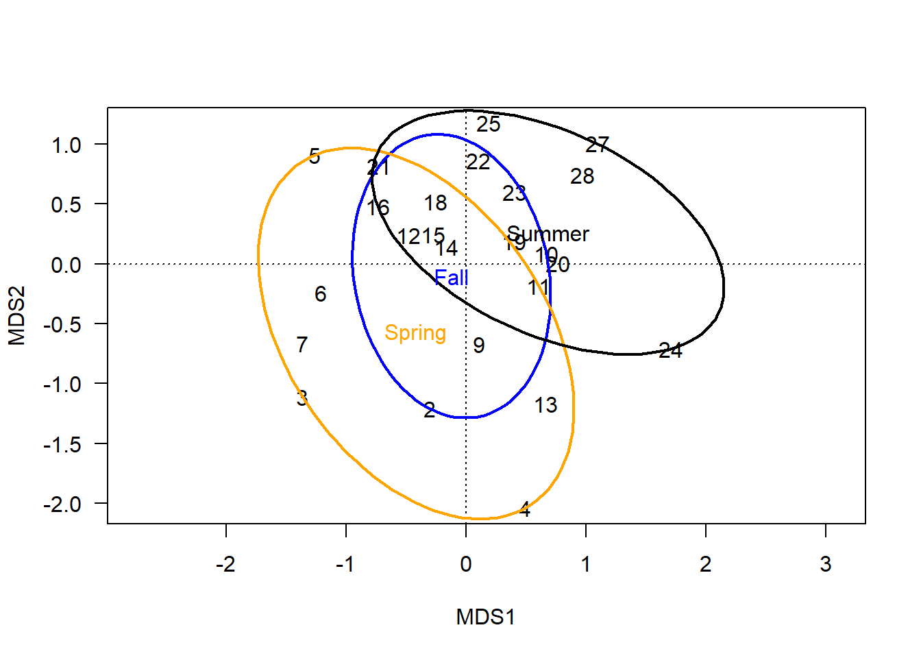
When kind='sd' or 'se', the ellipse represents a calculated region of error around each group’s centroid.
The confidence level is set with conf= and can be understood as how single-dimensional error bars or confidence intervals might be used in univariate plots to estimate the precision of estimated mean or centroid (se) or connect variation in the sampled data to the spread of the broader population (sd).
plot(chem_pca, type="n", las=1)
text(chem_pca, display = "sites",
     labels=row.names(chem_s))
ordiellipse(chem_pca, man$BurnSeason, display="sites",
            kind = "se", conf=0.95, label=T,
            lwd=2, col=c("blue","orange", "black"))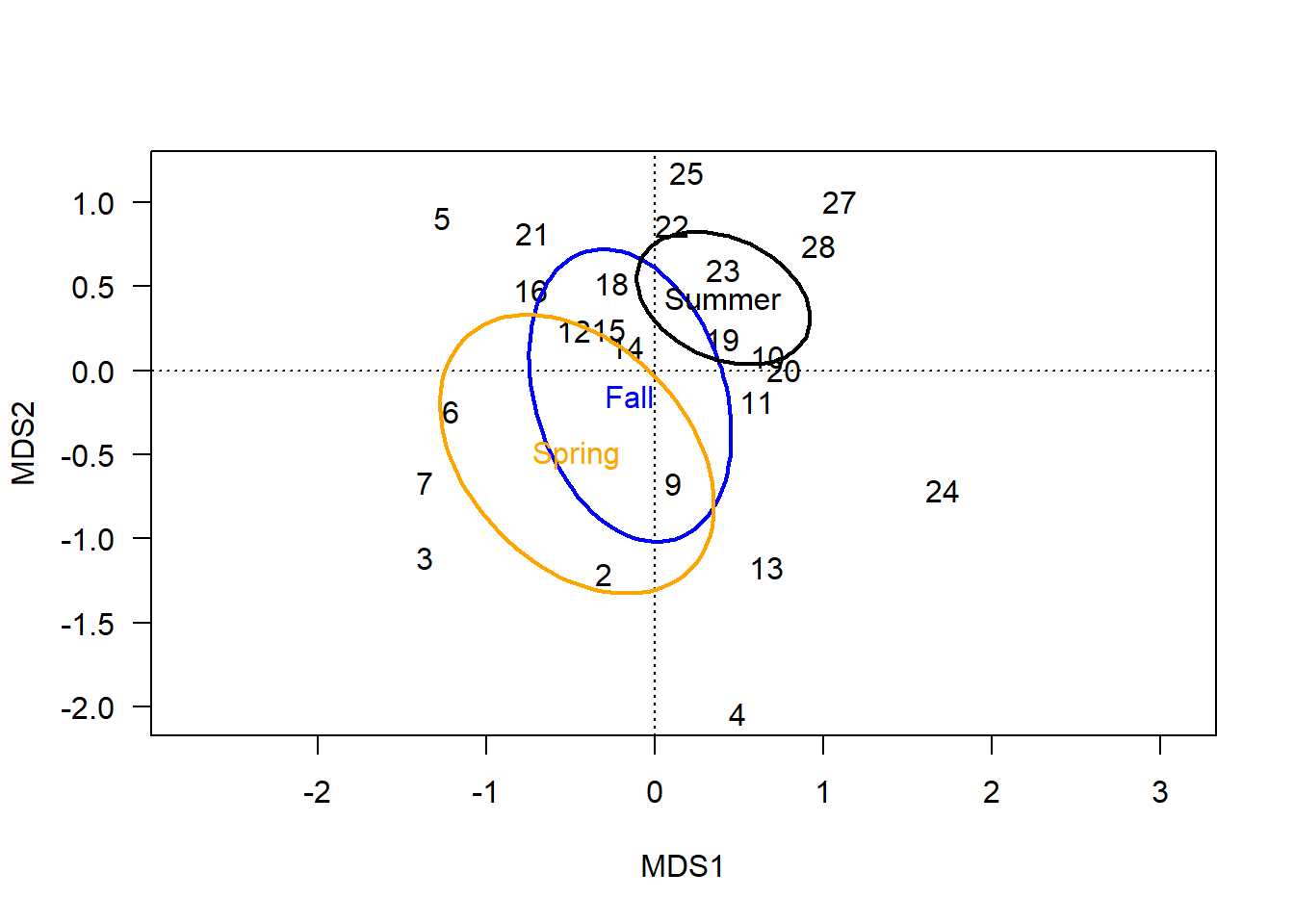
ordispider
One problem with polygons is that they only envelope the scores of a group, not identify each score by its group. If two groups overlap and a score does not create a corner or a curve in the hull or ellipse, respectively, it is difficult to determine to which group such scores belong.
Spiders offer a good solution for both identifying the group to which each score is assigned and highlighting the centroid of that group. This information helps give an idea of (1) how different groups are, in terms of the distance between their centroids; and (2) how tight each group’s variation is, by the length of the lines connecting each score to the centroid:
plot(chem_pca, type="n", las=1)
text(chem_pca, display = "sites",
     labels=row.names(chem_s))
ordispider(chem_pca, man$BurnSeason, display="sites",
           label=T, lwd=2, col=c("blue","orange", "black"))
Combining group ranges (spiders) with centroid probabilities (ellipses) is perhaps the nearest approximation to a multidimensional boxplot: information includes the centroids and their relative distance apart; error bars; and outliers. This is the best visual representation of the statistical tests vegan provides to determine whether differences between groups are likely to be meaningfully different.
plot(chem_pca, type="n", las=1)
ordiellipse(chem_pca, man$BurnSeason, display="sites",
            kind = "se", conf=0.95,
            label=F, col=c("blue","orange", "black"),
            draw = "polygon", alpha = 50)
ordispider(chem_pca, man$BurnSeason, display="sites",
           label=T, lwd=2, col=c("blue","orange", "black"))
In terms of a hypothesis about these groups, one might speculate that sites burned in the spring have different soil chemistry from sites burned in the summer, because their centroids are far apart and standard error ellipses do not overlap. The fall ellipse is different than both spring and summer, but the degree of overlap suggests soil chemistry under fall burns might not actually be meaningfully different than soils burned in the summer, and is unlikely to be different than those burned in the spring.
Testing groups
Testing differences among the levels (groups) of categorical variables in multivariate analysis follows the same principle and approach as in univariate analysis:
Are the group means (centroids) different relative to the spread of the data?
If the test returns an acceptable result and there are only two group levels, then the test is complete. However, if there are three or more groups, a post-hoc pairwise comparison is required to determine the differences among pairs of groups.
A major difference between the multivariate analyses used here and univariate tests is that the assumptions about distributions do not apply. vegan functions use multiple permutations to test for the likelihood an observed pattern in the data is due to chance.
The key function for testing groups (and gradients) against an ordination ad hoc–after the ordination has been fit and the latent variable described–is envfit.
It is set up similarly to the ordi* functions, but since it is a test, it uses formula notation:
envfit(chem_pca ~ man$BurnSeason) ##
## ***FACTORS:
##
## Centroids:
## MDS1 MDS2
## man.BurnSeasonFall -0.1484 -0.1485
## man.BurnSeasonSpring -0.4639 -0.4980
## man.BurnSeasonSummer 0.4049 0.4297
##
## Goodness of fit:
## r2 Pr(>r)
## man.BurnSeason 0.244 0.007 **
## ---
## Signif. codes: 0 '***' 0.001 '**' 0.01 '*' 0.05 '.' 0.1 ' ' 1
## Permutation: free
## Number of permutations: 999By default, envfit calculates the centroids in two dimensions, \(\textsf{MDS1}\)-\(\textsf{MDS2}\).
There is a decent argument for this; after all, two dimensions are all that are being shown on the page or screen.
But since we’re using a computer to perform multi-dimensional analyses precisely because we can’t really handle more than two dimensions otherwise, it seems silly to limit ourselves to hypothesis-testing in low dimensions, as well.
For instance, we know that the third axis is meaningful to explaining variation in the multivariate data:
summary(chem_pca)$cont %>%
as.data.frame %>% .[1:3] %>% round(2) %>% pander::pander() | importance.MDS1 | importance.MDS2 | importance.MDS3 | |
|---|---|---|---|
| Eigenvalue | 4.87 | 2.52 | 1.08 |
| Proportion Explained | 0.44 | 0.23 | 0.1 |
| Cumulative Proportion | 0.44 | 0.67 | 0.77 |
It makes sense, then, to include this third axis in our ad hoc analysis, as well.
We can do so via the choices= argument:
envfit(chem_pca ~ man$BurnSeason, choices = c(1:3))##
## ***FACTORS:
##
## Centroids:
## MDS1 MDS2 MDS3
## man.BurnSeasonFall -0.1484 -0.1485 0.6851
## man.BurnSeasonSpring -0.4639 -0.4980 -0.2563
## man.BurnSeasonSummer 0.4049 0.4297 -0.1250
##
## Goodness of fit:
## r2 Pr(>r)
## man.BurnSeason 0.2264 0.002 **
## ---
## Signif. codes: 0 '***' 0.001 '**' 0.01 '*' 0.05 '.' 0.1 ' ' 1
## Permutation: free
## Number of permutations: 999Notice that the goodness of fit improved.
Our data have three levels, though, so the results of envfit alone are not sufficient.
It just tells us that there is at least one difference between one burn season and one other, not which ones, or even how many combinations of seasons are different.
For this, we use the pairwise.* set of functions from RVAideMemoire, in this case, pairwise.factorfit:2
pairwise.factorfit(chem_pca, man$BurnSeason)##
## Pairwise comparisons using factor fitting to an ordination
##
## data: chem_pca by man$BurnSeason
## 999 permutations
##
## Fall Spring
## Spring 0.633 -
## Summer 0.112 0.006
##
## P value adjustment method: fdrAs we hypothesized, soil chemistry profiles under spring burns and summer burns are statistically-significantly different, but no other difference is.
Gradients
Recall that ad hoc multivariate analyses test for a correlation between known predictor variables and the latent variable that describes variation in the multivariate dataset. This relationship between the latent variable and known predictor variables is easiest to visualize with continuous environmental gradients.
There are at least two ways to show (and test) how well an environmental gradient correlates with the latent variable. One is to fit linear vectors, and the other is to fit non-linear gradients as smoothed surfaces.
Vectors
Vectors are fit with vectorfit, which is accessed with the envfit wrapper function.
In this case, the results of envfit are stored as an object for plotting and viewing the results.
Thanks to formula notation, envfit allows multiple variables, continuous and categorical, to be tested simultaneously with the y ~ x1 + x2 convention.
hd_v <- envfit(chem_pca ~ Humdepth + pH, varechem, choices = c(1:3))Note the use of the p.max argument, which allows one to set a threshold of \(P\) values.
No variable that exceeds the threshold will be plotted, which helps keep the information in the graph relevant.
plot(chem_pca, type="n", las=1)
  ordiellipse(chem_pca, man$BurnSeason, display="sites",
              kind = "se", conf=0.95,
              label=F, col=c("blue","orange", "black"),
              draw = "polygon", alpha = 50)
  ordispider(chem_pca, man$BurnSeason, display="sites",
             label=T, lwd=2, col=c("blue","orange", "black"))
  plot(hd_v, col="darkgreen", p.max = 0.1)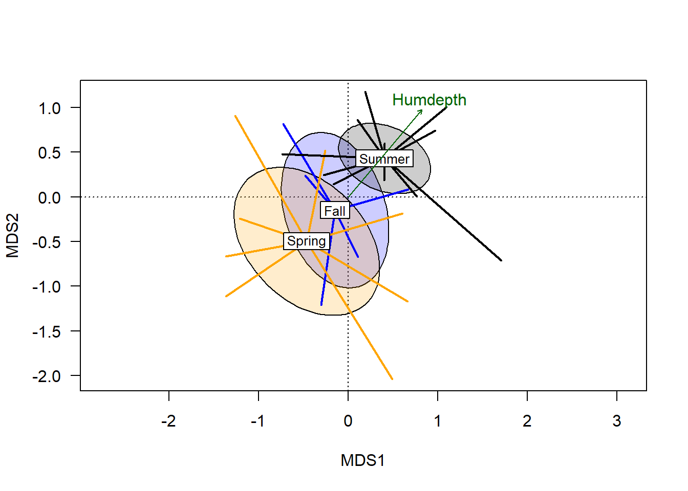
From this we see that the humus depth has a significant correlation with variation in the ordination (but pH does not, as it didn’t make the cut). The plotted vector extends from the origin, with the length relating to the magnitude of the correlation, and the angle showing the environmental gradient. Although the plotted arrow only goes in one direction, the gradient does extend 180\(^\circ\) in the opposite gradient.
Sites that score near the endpoint of the arrow are highest in the plotted variable (depth of humus layer), while sites further from the arrow’s endpoint are lowest on the humus depth gradient. With respect to the categorical vector, there is a correlation that suggests on average, plots burned in the spring had the lowest humus depth, while sites burned in the summer generally had the deepest humus layer.
Note the 45\(^\circ\) angle of the vector, orthogonal to either plotted axis. The degree to which a vector is parallel to an axis corresponds to the degree to which variation in that axis correlates with the plotted gradient. The fact that humus depth bisects the two primary axis highlights the value of using multivariate analysis.
Testing
Statistical results are stored in the envfit object:
hd_v ##
## ***VECTORS
##
## MDS1 MDS2 MDS3 r2 Pr(>r)
## Humdepth 0.62571 0.74404 -0.23427 0.2754 0.083 .
## pH -0.52993 -0.79999 0.28141 0.1100 0.487
## ---
## Signif. codes: 0 '***' 0.001 '**' 0.01 '*' 0.05 '.' 0.1 ' ' 1
## Permutation: free
## Number of permutations: 999The three \(\textsf{MDS}\) values refer to the endpoint of the arrow that plots the vector.
The goodness of fit statistics report the correlation between each variable and the latent variable.
Note that envfit is not sensitive to the order in which terms are added to the original model.
Smoothed surfaces
The angle of the plotted vector represents the general trend of the correlation between the gradient and the latent variable. An assumption in using vector fitting to test environmental gradients is that this relationship is linear, and perpendicular lines could be extended from the vector and even sites far away from the vector share the value at that point along the gradient. But this assumption doesn’t always hold.
ordisurf uses non-linear regression models to calculate smoothed surfaces for a predictor variable.
hd_s <- ordisurf(chem_pca, varechem$Humdepth, choices = c(1:3), plot=F)The results are called with summary and appear similar to a regression object from lm or glm:
summary(hd_s)##
## Family: gaussian
## Link function: identity
##
## Formula:
## y ~ s(x1, x2, k = 10, bs = "tp", fx = FALSE)
##
## Parametric coefficients:
## Estimate Std. Error t value Pr(>|t|)
## (Intercept) 2.2000 0.1189 18.5 2.81e-14 ***
## ---
## Signif. codes: 0 '***' 0.001 '**' 0.01 '*' 0.05 '.' 0.1 ' ' 1
##
## Approximate significance of smooth terms:
## edf Ref.df F p-value
## s(x1,x2) 2.466 9 0.769 0.0439 *
## ---
## Signif. codes: 0 '***' 0.001 '**' 0.01 '*' 0.05 '.' 0.1 ' ' 1
##
## R-sq.(adj) = 0.231 Deviance explained = 31.4%
## -REML = 23.654 Scale est. = 0.33952 n = 24These results indicate that the smoothed term Humdepth is statistically significant (\(P < 0.05\)).
When plotted, the ordisurf object connects site scores of similar values using parallel lines similar to the contours on a topographic map:
plot(chem_pca, display="sites", las=1)
plot(hd_s, add=T)
plot(hd_v, col="darkgreen", p.max = 0.1)
This graph confirms that the vector is generally a good representation of the gradient, although there is some evidence of non-linearity in the upper left quadrant.
In my opinion, the utility of these surfaces lies most in verifying that the vector returned by envfit is actually representing a linear gradient (and not just the average of a really wiggly one).
It is much cleaner to plot the vectors, especially when more than one gradient is found to have a significant correlation.
The surfaces add too much to the plot to allow other information essential for a reader to interpret the plot.
Now that we have confirmed that the vector is significant and indeed generally linear, we can build up a plot that uses several vegan functions, different colors, and a legend to combine a lot of information in a single graph:
plot(chem_pca, type="n", las=1,
     main = "Soil chemistry by burn season")
  ordiellipse(chem_pca, man$BurnSeason, display="sites",
              kind = "se", conf=0.95,
              label=F, col=c("blue","orange", "black"),
              draw = "polygon", alpha = 50)
  ordispider(chem_pca, man$BurnSeason, display="sites",
             label=F, lwd=2, col=c("blue","orange", "black"))
  plot(hd_v, col="darkgreen", p.max = 0.1)
  text(chem_pca, display = "species", col="darkred")
  legend("bottomright",
         title="Burn season",
         legend=c("Fall", "Spring", "Summer"),
         col=c("blue","orange", "black"),
         lty=1, bty="n")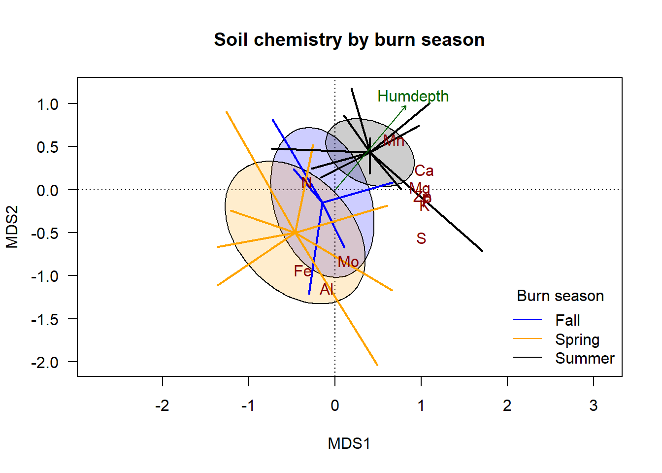
The addition of the species scores indicates which groups and ends of the gradient are generally associated with variation in each element. In this made-up dataset, soil under spring burns is generally highest in \(\textsf{Fe}\), \(\textsf{Al}\), and \(\textsf{Mo}\); soil under summer burns are generally highest in \(\textsf{Mn}\) and \(\textsf{Ca}\). The same correlations hold for humus depth.
Homework assignment
Disclaimer: We use PCA here for illustration purposes as the Euclidean distance is conceptually fairly simple. PCA is not the only choice for ordination is rarely the best choice for ecological data. vegan provides many alternatives to the Euclidean distance measure; see
?vegdist. See?metaMDSand?capscalefor non-metric and metric multidimensional scaling functions for analysis.↩envfitis a wrapper function forfactorfitandvectorfit, which test groups and gradients, respectively;envfitautomatically determines the type of data in each predictor variable in the formula notation and applies the appropriate function.↩