This second part of the introduction to mapping in \({\bf\textsf{R}}\) covers adding features to maps with ggplot2 and sf. Specific objectives include:
- Modify spatial data layers
- Add multiple layers of information to maps
- Find the interaction of two layers (crop one to another)
- Combine data from multiple sources
Walking through the script
Packages and data
pacman::p_load(lwgeom)              # dependency
pacman::p_load(tidyverse, sf,
               rnaturalearth,
               rnaturalearthdata)
Load Natural Earth data for South America as sf object:
sa_countries <- ne_countries(continent = "South America",
                             returnclass = "sf")
names(sa_countries)
## [1] "scalerank" "featurecla" "labelrank" "sovereignt" "sov_a3"
## [6] "adm0_dif" "level" "type" "admin" "adm0_a3"
## [11] "geou_dif" "geounit" "gu_a3" "su_dif" "subunit"
## [16] "su_a3" "brk_diff" "name" "name_long" "brk_a3"
## [21] "brk_name" "brk_group" "abbrev" "postal" "formal_en"
## [26] "formal_fr" "note_adm0" "note_brk" "name_sort" "name_alt"
## [31] "mapcolor7" "mapcolor8" "mapcolor9" "mapcolor13" "pop_est"
## [36] "gdp_md_est" "pop_year" "lastcensus" "gdp_year" "economy"
## [41] "income_grp" "wikipedia" "fips_10" "iso_a2" "iso_a3"
## [46] "iso_n3" "un_a3" "wb_a2" "wb_a3" "woe_id"
## [51] "adm0_a3_is" "adm0_a3_us" "adm0_a3_un" "adm0_a3_wb" "continent"
## [56] "region_un" "subregion" "region_wb" "name_len" "long_len"
## [61] "abbrev_len" "tiny" "homepart" "geometry"Quick refresher on how to view Natural Earth data as a tibble…
sa_countries %>%
  select(name, economy)
## Simple feature collection with 13 features and 2 fields
## geometry type: MULTIPOLYGON
## dimension: XY
## bbox: xmin: -81.41094 ymin: -55.61183 xmax: -34.72999 ymax: 12.4373
## CRS: +proj=longlat +datum=WGS84 +no_defs +ellps=WGS84 +towgs84=0,0,0
## First 10 features:
## name economy geometry
## 4 Argentina 5. Emerging region: G20 MULTIPOLYGON (((-65.5 -55.2...
## 21 Bolivia 5. Emerging region: G20 MULTIPOLYGON (((-62.84647 -...
## 22 Brazil 3. Emerging region: BRIC MULTIPOLYGON (((-57.62513 -...
## 29 Chile 5. Emerging region: G20 MULTIPOLYGON (((-68.63401 -...
## 35 Colombia 6. Developing region MULTIPOLYGON (((-75.37322 -...
## 46 Ecuador 6. Developing region MULTIPOLYGON (((-80.30256 -...
## 54 Falkland Is. 2. Developed region: nonG7 MULTIPOLYGON (((-61.2 -51.8...
## 67 Guyana 6. Developing region MULTIPOLYGON (((-59.75828 8...
## 124 Peru 5. Emerging region: G20 MULTIPOLYGON (((-69.59042 -...
## 131 Paraguay 5. Emerging region: G20 MULTIPOLYGON (((-62.68506 -...… then map in ggplot using geom_sf():
ggplot() +
geom_sf(data=sa_countries) 
Modifying layers
sf works very well with tidyverse and there are several useful functions that follow a familiar data wrangling format to customize a map.
Dissolve boundaries
Data often come with several levels of information that aren’t always necessary to include every time one makes a map. Note how the map above plots country boundaries, but perhaps one wants just the outline of the continent. One could go and find an layer of the continental outline and hope it all lines up. Better yet, one can just remove the lower-level boundaries in the current data.
Dissolving is the term given to removing feature boundaries to create an ‘empty’ outline.
Here is a quick tidy trick to perform a dissolve that uses the st_area function:
sa_cont <-
  sa_countries %>%
    mutate(area = st_area(.) ) %>%
      summarise(area = sum(area))

ggplot() +
geom_sf(data=sa_cont, fill="white") 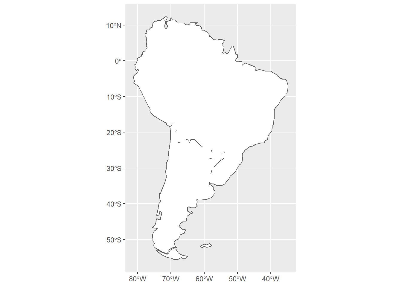
Multiple layers can be added to the same map with repeated calls to geom_sf.
Note that each needs to have its own data argument.
The order of the layers determines which features are covered up or sit on top.
ggplot() +
  geom_sf(data=sa_cont, fill="white") +
geom_sf(data=sa_countries, color="darkgrey", fill=NA) 
Add feature information
Basic aesthetic mapping in ggplot makes it easy to plot features by a column of information stored in the data used in geom_sf().
Here we use the pop_est column to shade each country by its estimated human population:
ggplot() +
  geom_sf(data=sa_cont, fill="white") +
  geom_sf(data=sa_countries,
          aes(fill=pop_est),
color="darkgrey") 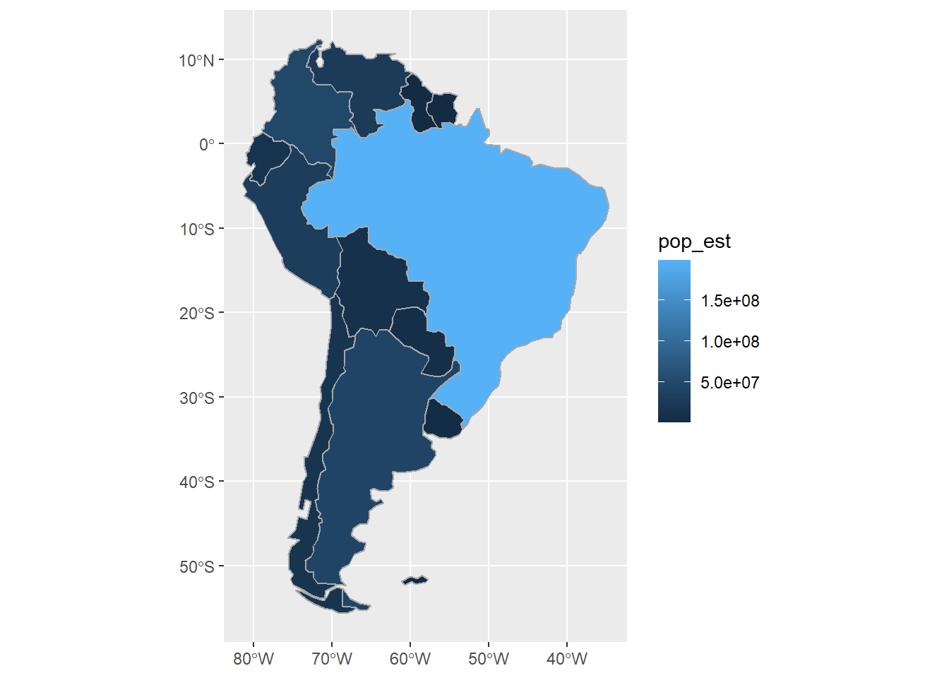
As with any ggplot, note the difference between fill= outside vs. inside of aes().
Create and plot new data column
Likewise, one can use basic tidyverse data wrangling functions to create new columns based on information available in the dataset.
Here we use the same st_area function as above to calculate human population density for each South American country:
sa_countries <-
  sa_countries %>%
    mutate(area = st_area(.) / 1000000,
           density = pop_est / area,
           density = as.numeric(density))

ggplot() +
  geom_sf(data=sa_cont, fill="white") +
  geom_sf(data=sa_countries,
          aes(fill=density),
          color="darkgrey") +
  scale_fill_viridis_c("Human population\ndensity (sq. km)")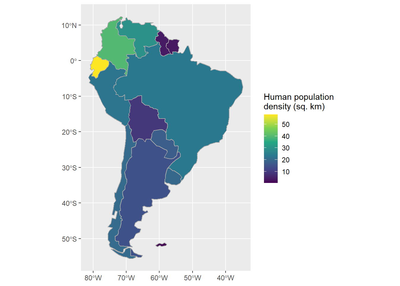
A perk of sf objects is that they aren’t exclusively spatial data.
One can still treat them as a tibble for any sort of summary or analysis:
sa_countries %>%
  as_tibble %>%
    select(name, density) %>%
      arrange(desc(density)) %>%
  rename(Country = name, `Humans per sq. km` = density) %>%
pander::pander("Human population density by country in South America. Lo siento para Las Malvinas.") | Country | Humans per sq. km |
|---|---|
| Ecuador | 58.12 |
| Colombia | 39.63 |
| Venezuela | 29.52 |
| Brazil | 23.36 |
| Peru | 22.56 |
| Chile | 20.37 |
| Uruguay | 19.76 |
| Paraguay | 17.43 |
| Argentina | 14.69 |
| Bolivia | 9.007 |
| Guyana | 3.681 |
| Suriname | 3.336 |
| Falkland Is. | 0.1919 |
Finally, use dplyr verbs to focus on one country in a tidy way:
sa_countries <-
  sa_countries %>%
    mutate(name = case_when(
                  name == "Falkland Is." ~ "Argentina",
                  T ~ name ) )
sa_countries %>%
  filter(name == "Argentina") %>%
    ggplot() +
geom_sf() 
Add features from other data sources
So far we’ve just used columns from a single dataset (although we did create a new object when we did the dissolve). Now we will add a totally new type of data from an external data source.
All of the features we’ve plotted so far have been polygons, but now we will add point features.
Download and open files from the Web
First, we need to fetch the data, which are stored on the course GitHub page as a .zip file, which is typical for ESRI shapefiles.
Typically we simply follow the URL in a browser, save the .zip file locally, and unzip it into a folder to which we can direct \({\bf\textsf{R}}\) to find it.
But often with spatial data, one might need to download and unpack several .zip files, and doing so one by one is onerous.
It would be helpful to be able to write a script that did it automatically.
Furthermore, often we don’t need the original .zip file once we’ve unpacked it and converted it to an sf object.
For these two reasons, we demonstrate here how to download and unzip a file from the Web via \({\bf\textsf{R}}\) script. While it could be saved anywhere, this script puts it in a temporary folder that will be automatically cleared out as per the local system settings.
The steps are as follows:
Store the file location as an object:
sa_cities_url = "https://github.com/devanmcg/IntroRangeR/raw/master/data/SouthAmericanCities.zip"Create a temporary directory called tmp_dir:
tmp_dir = tempdir()Create an empty .zip file in tmp_dir called tmp:
tmp = tempfile(tmpdir = tmp_dir, fileext = ".zip")Download the .zip file (argument 1) to the desired folder (argument 2):
download.file(sa_cities_url, tmp) Now unzip the folder…
unzip(tmp, exdir = tmp_dir)… and load it into the global environment as an sf object:
sa_cities <- read_sf(tmp_dir, "South_America_Cities") sa_cities ## Simple feature collection with 60 features and 3 fields
## geometry type: POINT
## dimension: XY
## bbox: xmin: -79.90939 ymin: -51.71 xmax: -34.91464 ymax: 11.01429
## geographic CRS: WGS 84
## # A tibble: 60 x 4
## NAME COUNTRY CAPITAL geometry
## <chr> <chr> <chr> <POINT [°]>
## 1 Rio Gallegos Argentina N (-69.41 -51.71)
## 2 Comodoro Rivadavia Argentina N (-67.5 -45.83)
## 3 Puerto Montt Chile N (-73 -41.48)
## 4 Bahia Blanca Argentina N (-62.27407 -38.72527)
## 5 Concepcion Chile N (-72.85164 -36.8833)
## 6 Montevideo Uruguay Y (-56.17 -34.92)
## 7 Buenos Aires Argentina Y (-58.40959 -34.6654)
## 8 Santiago Chile Y (-70.64751 -33.47503)
## 9 Rosario Argentina N (-60.66394 -32.93774)
## 10 Valparaiso Chile N (-71.29934 -32.9)
## # ... with 50 more rowsNote that the geometry is identified as \(\textsf{Point}\).
We can easily add it to the map; geom_sf will automatically take care of the geometries:
ggplot() +
  geom_sf(data=sa_cont, fill="white") +
  geom_sf(data=sa_countries, color="darkgrey", fill=NA) +
  geom_sf(data=sa_cities)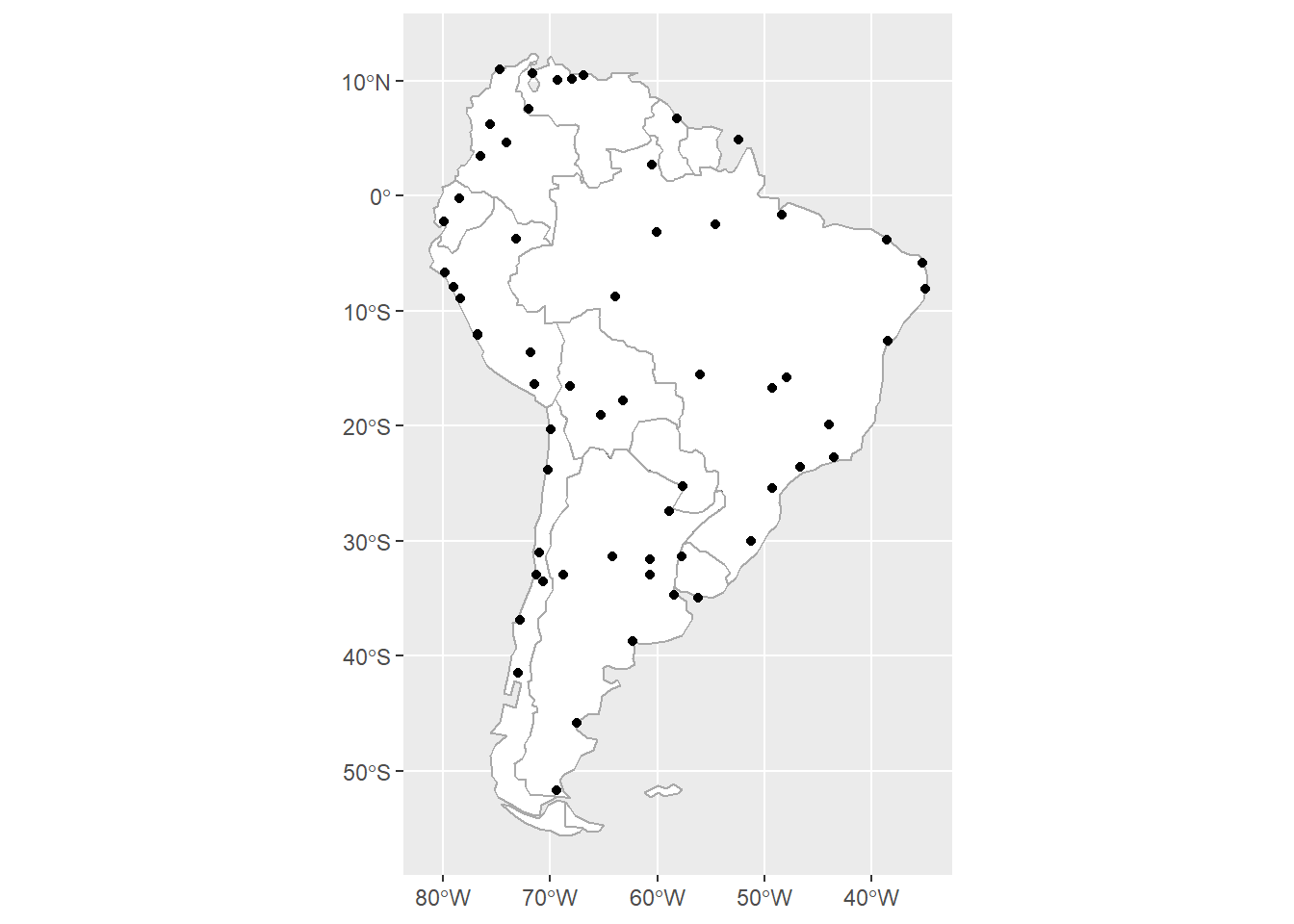
One can use filter to zoom in on one country, but it must be done to each call to geom_sf when different data objects are involved:
ggplot() +
  geom_sf(data=sa_countries  %>%
            filter(name == "Argentina"),
          color="darkgrey", fill="white") +
  geom_sf(data=sa_cities %>%
            filter(COUNTRY == "Argentina")) +
  geom_sf_label(data=sa_cities %>%
            filter(COUNTRY == "Argentina"),
            aes(label=NAME), nudge_y = 1.5 ) +
  theme(axis.title = element_blank())
sf might return a warning about correct results for long/lat data, but you can ignore it.
Add features with different CRS
Next we will download an additional shapefile, with features stored as polygons that identify ecological regions for South America.
The data are stored online as a .zip file, so we can use the same steps as above to download, unzip, and read into \({\bf\textsf{R}}\) as an sf object:
EPA_URL = "http://www.ecologicalregions.info/data/sa/sa_eco_l3.zip"
tmp_dir = tempdir()
tmp     = tempfile(tmpdir = tmp_dir, fileext = ".zip")
download.file(EPA_URL, tmp)
unzip(tmp, exdir = tmp_dir)
EPA_SCA <- read_sf(tmp_dir, "sa_eco_l3")
ggplot(EPA_SCA) +
geom_sf() 
The default graph simply shows the outlines of the lowest-level features.
Ecoregions are stored at three levels. Level 1 are the broadest, most general biomes, while Level 3 is the most specific, often defined by specific vegetation types.
One maps a specific level by using the fill= aesthetic:
EPA_SCA %>%
  mutate_at(vars(LEVEL3:LEVEL1), as.factor) %>%
  ggplot() +
    geom_sf(aes(fill=LEVEL1))
Cropping via intersect
One might notice a difference between the ecological data and the political maps: the former includes Central America while the other does not. It is straightforward to remove extraneous features from one spatial data object, essentially by cropping its outermost boundary to that of another spatial data object’s boundary.1
In sf this action is called an intersection, and we use the st_intersection function.
But to get spatial data objects to work together, they must be in the same projection:
EPA_SCA ## Simple feature collection with 3546 features and 9 fields
## geometry type: POLYGON
## dimension: XY
## bbox: xmin: -3988232 ymin: -2605909 xmax: 2743070 ymax: 6129532
## projected CRS: International_1967_Albers
## # A tibble: 3,546 x 10
## AREA PERIMETER SA_ECO_ALB SA_ECO_A_1 LEVEL3 LEVEL2 LEVEL1 Shape_Leng
## <dbl> <dbl> <int> <int> <chr> <dbl> <int> <dbl>
## 1 1.81e6 6853. 2 2 16.1.1 16.1 16 6853.
## 2 5.75e5 3528. 3 3 16.1.1 16.1 16 3528.
## 3 8.31e5 6550. 4 4 16.1.1 16.1 16 6550.
## 4 2.27e6 8769. 5 5 16.1.1 16.1 16 8769.
## 5 2.13e6 7619. 6 8 16.1.1 16.1 16 7619.
## 6 5.84e5 4320. 7 7 16.1.1 16.1 16 4320.
## 7 1.37e6 4964. 8 6 16.1.1 16.1 16 4964.
## 8 2.97e6 14901 9 10 16.1.1 16.1 16 14901.
## 9 1.47e6 9004. 10 12 16.1.1 16.1 16 9004.
## 10 2.68e6 6752. 11 17 16.1.1 16.1 16 6752.
## # ... with 3,536 more rows, and 2 more variables: Shape_Area <dbl>,
## # geometry <POLYGON [m]>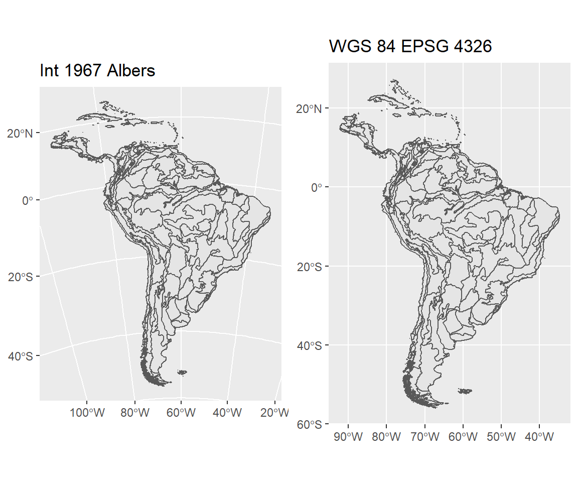
Note the curved lines of the Albers projection.
The EPA ecoregion data uses the Albers 1967 projection, which is wholly incompatible with the longitude/latitude systems our other objects are in. So the first necessary step is to convert to a common CRS, then perform the intersection:
sa_epa <- EPA_SCA %>%
           mutate_at(vars(LEVEL3:LEVEL1), as.factor) %>%
            st_transform(4326) %>%
              st_intersection(sa_cont)
Now and then one might get an error at this point in the workflow, something like
TopologyException: Input geom 1 is invalid: Ring Self-intersection at or near point…
The error is discussed here.
Basically, the solution is to make the geometry valid, with a handy function called
st_make_valid.
Depending on which sf object is causing the error, either introduce this function above
st_intersection in the pipe, or wrap it around the object in st_intersection().
Remember that the lines mapped represent the delineations of the finest-scale features in the dataset, in this case, the Level 3 ecoregions:
ggplot(sa_epa) +
geom_sf(aes(fill=LEVEL3), show.legend = FALSE ) 
To map higher levels without the internal divisions, we perform another dissolve:
sa_epa_L1 <- sa_epa %>%
              mutate(area = st_area(.) ) %>%
                group_by(LEVEL1) %>%
                summarise()

ggplot(sa_epa_L1) +
geom_sf(aes(fill=LEVEL1)) 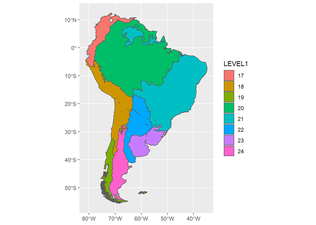
Associating spatial and non-spatial data
The map would be much more informative if it had meaningful labels for the legend, rather than simply the ecoregion number. Unfortunately this information is not in this specific dataset, but they are available on the course GitHub page:
L1_names_URL = "https://raw.githubusercontent.com/devanmcg/IntroRangeR/master/12_RasGIS/SouthAmericaLevel1Names.csv"

sa_L1_names <- read_csv(L1_names_URL) %>%
mutate(Level1 = as.factor(Level1))| Level1 | Level 1 Ecoregion |
|---|---|
| 13 | Temperate Sierras |
| 14 | Mexican Tropical Dry Forests |
| 15 | Middle American Tropical Wet Forests |
| 16 | West Indies |
| 17 | Northern Andes |
| 18 | Central Andes |
| 19 | Southern Andes |
| 20 | Amazonian-Orinocan Lowland |
| 21 | Eastern Highlands |
| 22 | Gran Chaco |
| 23 | Pampas |
| 24 | Monte-Patagonian |
These are clearly helpful labels, but this is a simple tibble, not a spatial sf object.
Fortunately we can add the labels to the sf object in a tidy way:
sa_epa_L1 <-
  sa_epa_L1 %>%
    left_join(sa_L1_names, by=c("LEVEL1"="Level1"))
sa_epa_L1
## Simple feature collection with 8 features and 2 fields
## geometry type: MULTIPOLYGON
## dimension: XY
## bbox: xmin: -81.32674 ymin: -55.61017 xmax: -34.79012 ymax: 12.43177
## geographic CRS: WGS 84
## # A tibble: 8 x 3
## LEVEL1 geometry `Level 1 Ecoregion`
## <fct> <MULTIPOLYGON [°]> <chr>
## 1 17 (((-69.69544 -54.86476, -69.67552 -54.8624, -69.6~ Northern Andes
## 2 18 (((-65.43958 -28.33546, -65.37718 -28.34834, -65.~ Central Andes
## 3 19 (((-69.02959 -55.46252, -69.03994 -55.46033, -69.~ Southern Andes
## 4 20 (((-63.42212 -15.09734, -63.35991 -15.1597, -63.2~ Amazonian-Orinocan ~
## 5 21 (((-48.52598 -27.45306, -48.52886 -27.45169, -48.~ Eastern Highlands
## 6 22 (((-62.23239 -39.20609, -62.23465 -39.20393, -62.~ Gran Chaco
## 7 23 (((-62.35636 -38.81733, -62.36428 -38.81409, -62.~ Pampas
## 8 24 (((-69.99024 -53.71317, -69.98009 -53.70756, -69.~ Monte-PatagonianNow re-plot, but set fill to the new column with meaningful labels:
sa_L1_gg <-
  ggplot() +
    geom_sf(data=sa_epa_L1, aes(fill=`Level 1 Ecoregion`))
sa_L1_gg
To further dress up the map, we can add the political boundaries and specify the fill gradient to use the trendy viridis color palette:
sa_L1_gg +
  geom_sf(data=sa_countries, fill=NA, color="white") +
  scale_fill_viridis_d(alpha=0.75)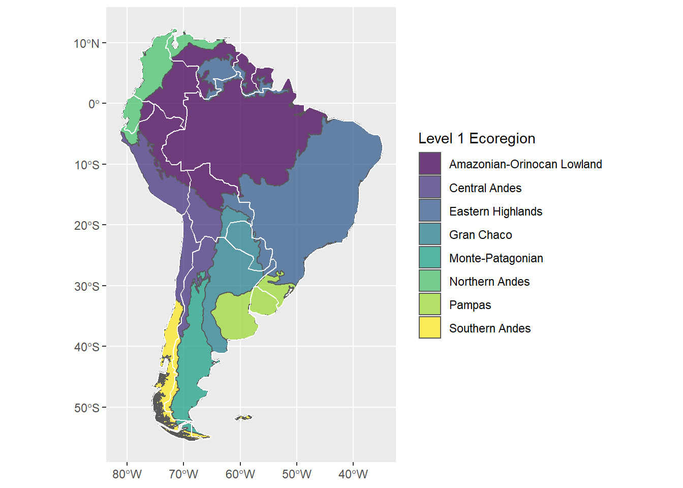
Homework assignment
The raster package provides a function literally called
crop.↩