Overview
To conduct a linear regression is to test for a linear relationship between two continuous variables: as one variable changes, does the other respond in a predictable manner? The linear model sorts how much of the change in the response variable can be attributed to change in the predictor variable relative to random noise.
When considering what drives patterns in a response variable, we are often interested in more than one predictor variable. Multiple regression is a solution for testing a single response variable against \(> 1\) predictor variables.
Generally speaking, there are at least two approaches that might motivate using multiple regression:
- Comparing the relative importance of potentially explanatory variables
- Considering the effect of a predictor variable within the context of another predictor variable
Objectives
- Plot trendlines with
geom_smooth - Learn to fit and interpret
lmobjects with continuous predictor variables, and \(> 1\) predictor variables - Fit multiple variables to a common scale using
scale() - Calculate confidence intervals with
confint()and plot withgeom_errorbar - Include interaction terms in
lmobjects
Walking through the script
pacman::p_load(tidyverse) If you are continuing from Lesson 8.1 without restarting \({\bf\textsf{R}}\), your data should be all set. If not, prep the data just as we did before:
  mtcars <- mutate_at(mtcars, vars(cyl, am),
                      as.factor) %>%
            mutate(am = recode(am, "0"="Automatic",
                                   "1"="Manual"),
                   am = factor(am, levels=c("Manual",
                                            "Automatic")),
                   lmpg = log(mpg)) %>%
            rename(transmission = am)
Linear regression
Testing a continuous response variable against a continuous predictor variable is called linear regression.
To present linear model fits graphically, start with a scatterplot of the data…
sp_gg <-
  ggplot(mtcars, aes(x=hp, y=mpg)) + theme_bw(14) +
    geom_point()
… and add a trendline with geom_smooth:
sp_gg + geom_smooth(method='lm', se=FALSE)
geom_smooth is powerful.
It can fit a line for almost any statistical model one can make in \({\bf\textsf{R}}\).
By default, the trendline is a curvy loess function, so we need to specify method='lm'; this actually sends geom_smooth off to calculate a linear regression using lm and then it plots these results, similar to how stat_functionchugs a function defined by fun= and parameterized with args=.
Indeed, geom_smooth will pass any optional arguments to the function specified in method= via a similar args=list() construction.
By default, geom_smooth adds a 95% confidence interval around the trendline.
Here’s a totally default call:
sp_gg + geom_smooth( )
I don’t know why the default is to add the shaded 95% confidence interval, but you should pretty much always turn it off with se = F.
¯\_(ツ)_/¯.
We use lm() to test for a linear relationship between the (log) response variable, lmpg, and the predictor variable, hp:
hp_lm <- lm(lmpg ~ hp, mtcars)There are several options view the results of the linear model.
coef() returns just the \(\beta\) coefficients:
coef(hp_lm)## (Intercept) hp
## 3.460466874 -0.003428734summary() returns the full model results, including both the results of the linear model, goodness-of-fit statistics (\(R^2\)), and an \(F\) test.
One can focus on the linear model results, stored in the coefficients matrix:
summary(hp_lm)$coefficients## Estimate Std. Error t value Pr(>|t|)
## (Intercept) 3.460466874 0.0785838302 44.035355 8.047220e-29
## hp -0.003428734 0.0004866904 -7.045001 7.853353e-08If one is interested in the \(F\) test, one can call anova() to get the full ANOVA table:
anova(hp_lm)## Analysis of Variance Table
##
## Response: lmpg
## Df Sum Sq Mean Sq F value Pr(>F)
## hp 1 1.7132 1.71320 49.632 7.853e-08 ***
## Residuals 30 1.0355 0.03452
## ---
## Signif. codes: 0 '***' 0.001 '**' 0.01 '*' 0.05 '.' 0.1 ' ' 1Note that although the \(P\) values are the same, these tables perform different calculations. The \(t\) statistic is the ratio of the \(\beta\) coefficient to the error associated with the estimate, or
\(t = -6.74 = \frac{-0.0682282}{0.010119}\)
It maintains the sign of the \(\beta\) estimate because the \(t\) distribution is two-sided.
In the ANOVA, however, the \(F\) statistic is calculated as the dividend of the mean sum of squares of the term over the residual error:
\(F = \frac{Mean~Sum~Squares_{Group}}{Mean~Sum~Squares_{Residuals}}\)
\(45.46 = \frac{678.37}{14.92}\)
Because these values are derived from the sums of squared error, the sign of negative effects are lost, thus the \(F\) distribution is one-sided. Therefore one would need to see the data to determine the direction of a significant effect.
To circle back to the discussion of weak alternative hypotheses \(H_a\) vs. strong \(H_A\), \(t\) statistics are better at informing the latter because the two-sided \(t\) distribution can indicate whether the slope is positive or negative. \(F\) statistics can only inform the weaker \(H_a\), reporting whether there is any evidence against the null hypothesis. But the predicted direction of the effect should still be stated a priori; don’t just state a lame \(H_a\) and rely upon the \(t\) statistic to tell you which direction it goes.
Fitting multiple regression models
Multiple regression is testing a single response variable against two or more predictor variables.
The additional variables can be continuous or categorical.
We’ll start with two continuous variables.
Our trusty response variable is, of course, fuel economy, measured as miles per gallon and stored as mpg.
But there are several variables in the dataset that could potentially explain variability in fuel economy: More powerful cars might use more fuel (larger engines with more cylinders, gear ratios suited more for power than economy); larger, heavier cars might take more fuel to drag around.
We can use multiple regression to compare the relative effect of several potentially explanatory variables:
hp: horsepower, a US Customary measure of power produced by the enginewt: how heavy is the car that the engine has to pull around?drat: How many times the axle turns for every turn of the driveshaft
Recall the statistical formula for a line:
\(y_i = \beta_0 + \beta_1 x_i + \varepsilon\)
where \(\beta_0\) is the Y axis intercept, \(\beta_1\) is the slope, and \(\varepsilon\) is the residual error.
The formula for multiple regression modifies it only slightly:
\(y = \beta_0 + \beta_1 x_1 + ... \beta_n x_n + \varepsilon\)
where \(\beta_0\) is the Y axis intercept, \(\beta_1\) is the slope of the first term, \(x_1\), with additional variables added – each with their own \(\beta\) coefficient, up to \(x_n\).
The formula for our example would look something like
\(mpg = \beta_0 + \beta_1 hp + \beta_2 wt + \beta_3 drat + \varepsilon\)
In R’s y ~ x formula notation, we add additional predictor variables to the RHS separated by \(+\):
mr_lm <- lm(mpg ~ hp + wt + drat, mtcars)Assessing model results
Significance testing
Many researchers are \(P\) value crazy, and just want to know which, if any, terms are significant.
While using anova() might jump to your mind, conducting an \(F\) test in R is fraught with peril and I recommend staying away from anova() at this point.
Rather, let’s use the \(t\) statistics to test the significance of these three continuous variables. Remember there are two approaches:
A plain call to summary() and get all of the output:
summary(mr_lm)##
## Call:
## lm(formula = mpg ~ hp + wt + drat, data = mtcars)
##
## Residuals:
## Min 1Q Median 3Q Max
## -3.3598 -1.8374 -0.5099 0.9681 5.7078
##
## Coefficients:
## Estimate Std. Error t value Pr(>|t|)
## (Intercept) 29.394934 6.156303 4.775 5.13e-05 ***
## hp -0.032230 0.008925 -3.611 0.001178 **
## wt -3.227954 0.796398 -4.053 0.000364 ***
## drat 1.615049 1.226983 1.316 0.198755
## ---
## Signif. codes: 0 '***' 0.001 '**' 0.01 '*' 0.05 '.' 0.1 ' ' 1
##
## Residual standard error: 2.561 on 28 degrees of freedom
## Multiple R-squared: 0.8369, Adjusted R-squared: 0.8194
## F-statistic: 47.88 on 3 and 28 DF, p-value: 3.768e-11Or focus on the component of the lm object that we want, coefficients, using $ and pouring into a table formatter like pander() so it looks nice:
summary(mr_lm)$coefficients %>%
pander::pander() | Estimate | Std. Error | t value | Pr(>|t|) | |
|---|---|---|---|---|
| (Intercept) | 29.39 | 6.156 | 4.775 | 5.134e-05 |
| hp | -0.03223 | 0.008925 | -3.611 | 0.001178 |
| wt | -3.228 | 0.7964 | -4.053 | 0.0003643 |
| drat | 1.615 | 1.227 | 1.316 | 0.1988 |
Engine power hp and car weight wt have significant, negative relationships with fuel economy mpg (\(P \le 0.05\)), but the trend towards a positive association between differential gear ratio drat and mpg is not statistically significant (\(P > 0.05\)).
Determining effect sizes
Often in multiple regression, we are at least as interested in the relative effects of the different variables as we are in which ones have \(P < 0.05\). Heck, the ANOVA table doesn’t even tell us which variables have a negative or positive relationship, since the \(F\) distribution is one-sided.
The direction and relative strength of effect in a regression comes from the slope of each term, which is stored in the linear model as the estimated \(\beta\) coefficents:
coef(mr_lm)## (Intercept) hp wt drat
## 29.3949345 -0.0322304 -3.2279541 1.6150485The absolute value of the coefficients corresponds to their effect size–the larger the absolute value of the coefficient, the more \(y\) changes with 1 unit of change in \(x\).
One must use caution, however, because the units of the variables factor into the coefficient, and if the units of two or more variables are on different scales, their coefficients will be on different scales, as well.
So while it is approprite to conclude that wt has greater influence on mpg than hp because \(|-3.23| > |-0.03|\), it would be inappropriate to conclude that wt had \(100x\) the effect.
If the relative magnitude is important, once must put all variables on the same scale, which is easily done with the scale() function.
There are two options to apply scale and refit the model:
sc1_lm <-
  mtcars %>%
    select(mpg, hp, wt, drat) %>%
      mutate_all(~scale(.)) %>%
        lm(mpg ~ hp + wt + drat, .)
coef(sc1_lm) %>%
pander::pander() | (Intercept) | hp | wt | drat |
|---|---|---|---|
| 7.088e-17 | -0.3667 | -0.524 | 0.1433 |
sc2_lm <- lm(scale(mpg) ~ scale(hp) + scale(wt) + scale(drat), mtcars)
coef(sc2_lm) %>%
pander::pander() | (Intercept) | scale(hp) | scale(wt) | scale(drat) |
|---|---|---|---|
| 7.088e-17 | -0.3667 | -0.524 | 0.1433 |
I prefer the first but it is mainly a matter of style.
After scaling, we see that indeed, wt still has a greater effect than hp but not by orders of magnitude.
The scaling step isn’t necessary if one wants only to (1) determine the sign of the effects or (2) rank the relative effects of several variables, but quantifying their relative effects requires scaling.
Confidence intervals
However, these coefficients are estimates, with associated error. To have an effect, they must be different than zero.1
Confidence intervals allow one to determine whether a regression coefficient is different from zero. The confidence interval is defined as the range within one can expect to find a random observation a certain proportion of the time (say, a certain proportion of random draws); since the natural sciences fetishizes \(\alpha = 0.05\), we most often see confidence intervals set as \(1 - 0.05\), or \(95%\).
confint() returns confidence intervals from regression models.
\(95%\) is the default but can be changed with level.
confint(mr_lm) %>%
pander::pander() | 2.5 % | 97.5 % | |
|---|---|---|
| (Intercept) | 16.78 | 42.01 |
| hp | -0.05051 | -0.01395 |
| wt | -4.859 | -1.597 |
| drat | -0.8983 | 4.128 |
When the confidence interval for a model term does not include zero we conclude that variable has a non-zero effect on the response variable, which is equivalent to saying it is statistically signficant. The coefficient should be the median of the confidence interval, and thus the signs of each endpoint of the confidence interval for a non-zero effect will both be the same as the sign of the coefficent.
Visualization
Visualizing three continuous predictor variables is difficult (impossible?) in a scatterplot. To see the pairwise relationships in the raw data, one can use a scatterplot matrix:
pacman::p_load(GGally)
ggpairs(mtcars, columns = c("mpg","hp", "wt", "drat"))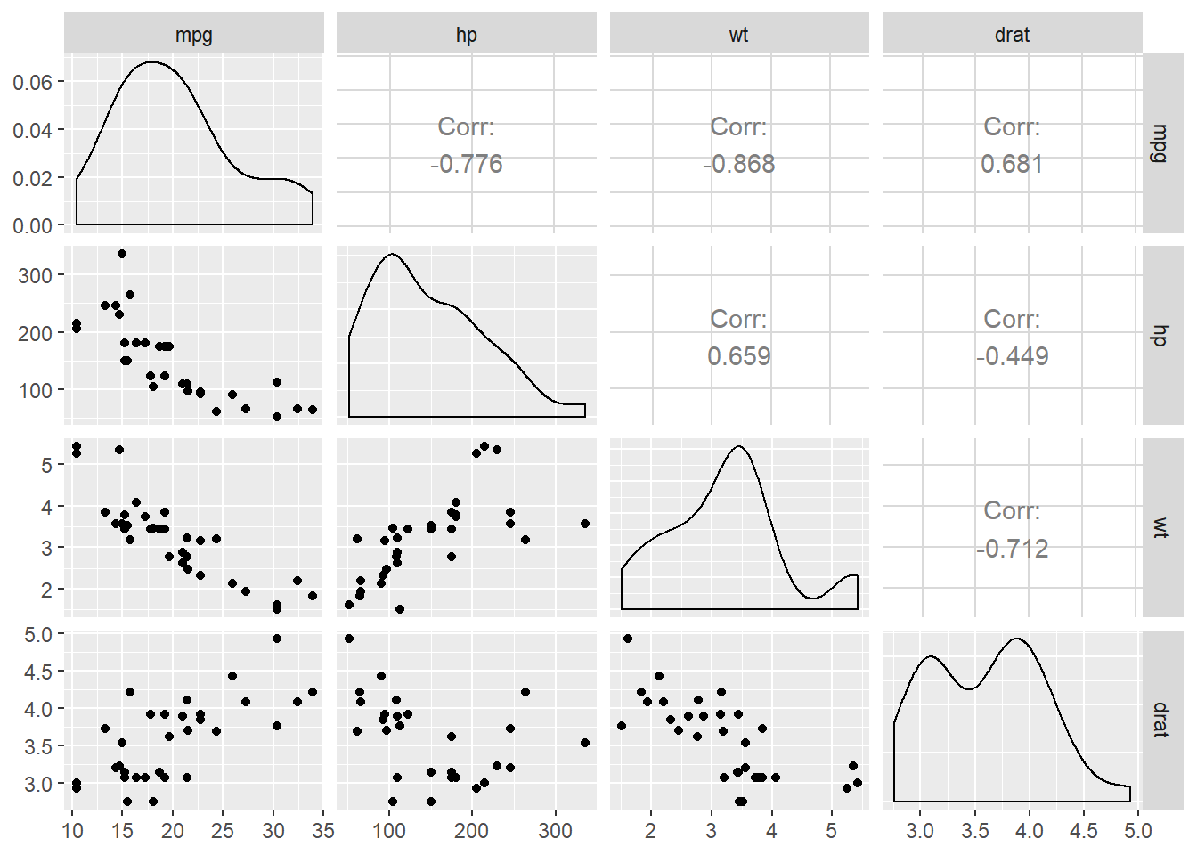
Once the multiple regression has been fit, the coefficients and the confidence intervals can be combined into a table for ggplot.
It is a bit tricky, though, because coef() prints in wide format and confint() prints in long format.
Here’s a simple function called coefR() that combines them into a tidy object:
coefR <- function(x) {
              require(tidyverse)
              confint(x) %>%
              as.data.frame() %>%
              rownames_to_column("name") %>%
              full_join(enframe(coef(x))) %>%
              setNames(c("term", "lwr", "upr", "est")) %>%
              select(term, lwr, est, upr)
            }
Now call the function on the lm object:
terms <- coefR(mr_lm)
terms %>% pander::pander() | term | lwr | est | upr |
|---|---|---|---|
| (Intercept) | 16.78 | 29.39 | 42.01 |
| hp | -0.05051 | -0.03223 | -0.01395 |
| wt | -4.859 | -3.228 | -1.597 |
| drat | -0.8983 | 1.615 | 4.128 |
We can easily plot the data in this table to visualize the regression results.
Unless one has a specific way to interpret it, the intercept term, \(\beta_0\), isn’t much use in a multiple regression model, so we’ll simply remove the top row using slice:2
terms %>%
  slice(-1) %>%
ggplot(aes(x = term)) + theme_bw(14) +
  geom_hline(yintercept = 0, lty = 2, color="grey70") +
  geom_errorbar(aes(ymin = lwr, ymax = upr),
                width = 0.1, size = 1, col="blue") +
  geom_point(aes(y = est), shape = 21,
             col = "blue", fill = "lightblue",
             size = 4, stroke = 1.25) +
coord_flip() 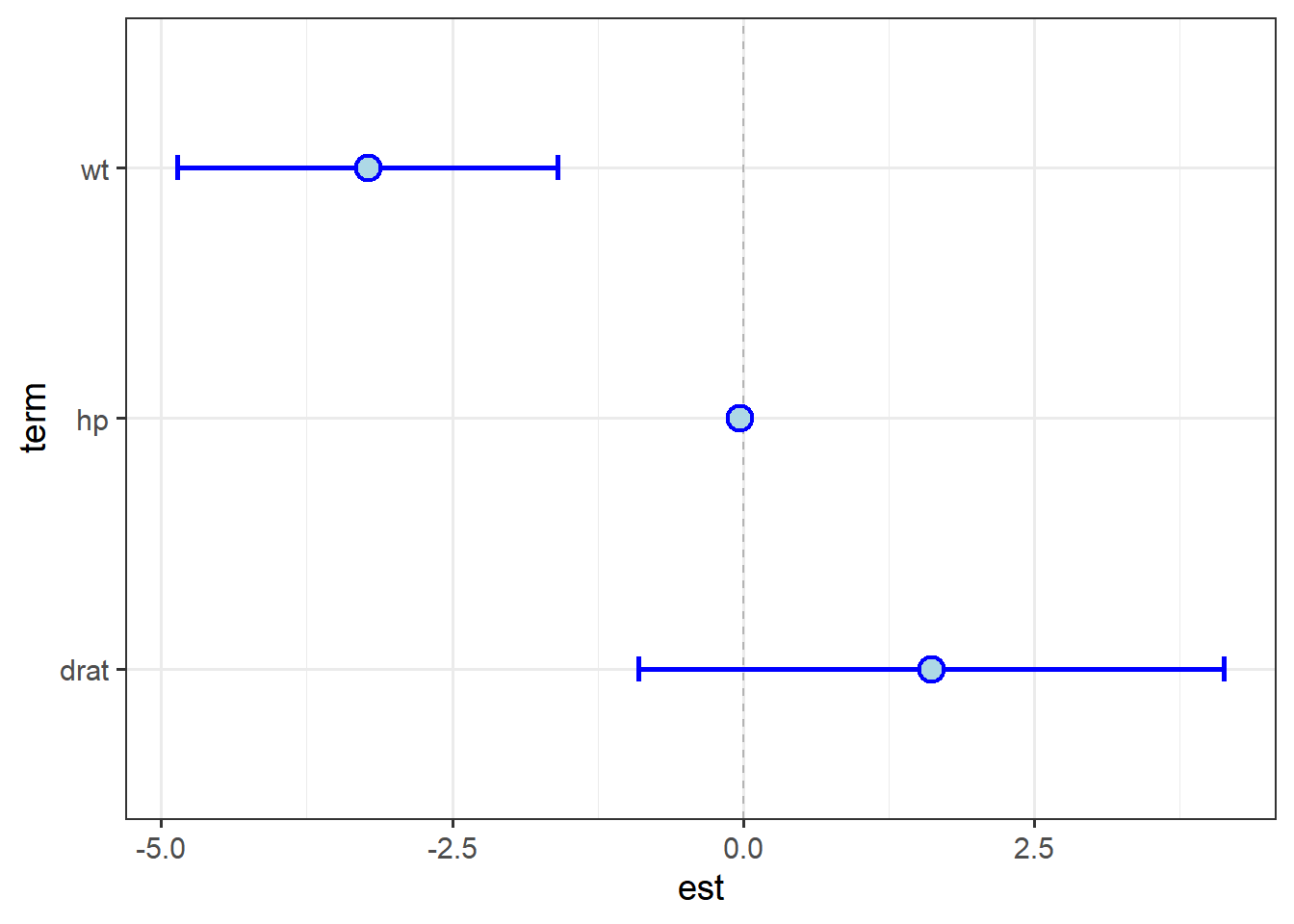
One can see the effect of scale mis-matches; the interval around hp essentially disappears.
The size of the point is such that it looks like it overlaps zero.
Let’s re-plot with the model fit to scaled data:
coefR(sc1_lm) %>%
  slice(-1) %>%
ggplot(aes(x = term)) + theme_bw(14) +
  geom_hline(yintercept = 0, lty = 2, color="grey70") +
  geom_errorbar(aes(ymin = lwr, ymax = upr),
                width = 0.1, size = 1, col="blue") +
  geom_point(aes(y = est), shape = 21,
             col = "blue", fill = "lightblue",
             size = 4, stroke = 1.25) +
  coord_flip() +
  labs(y = "Regression coefficient",
       x = "Model term")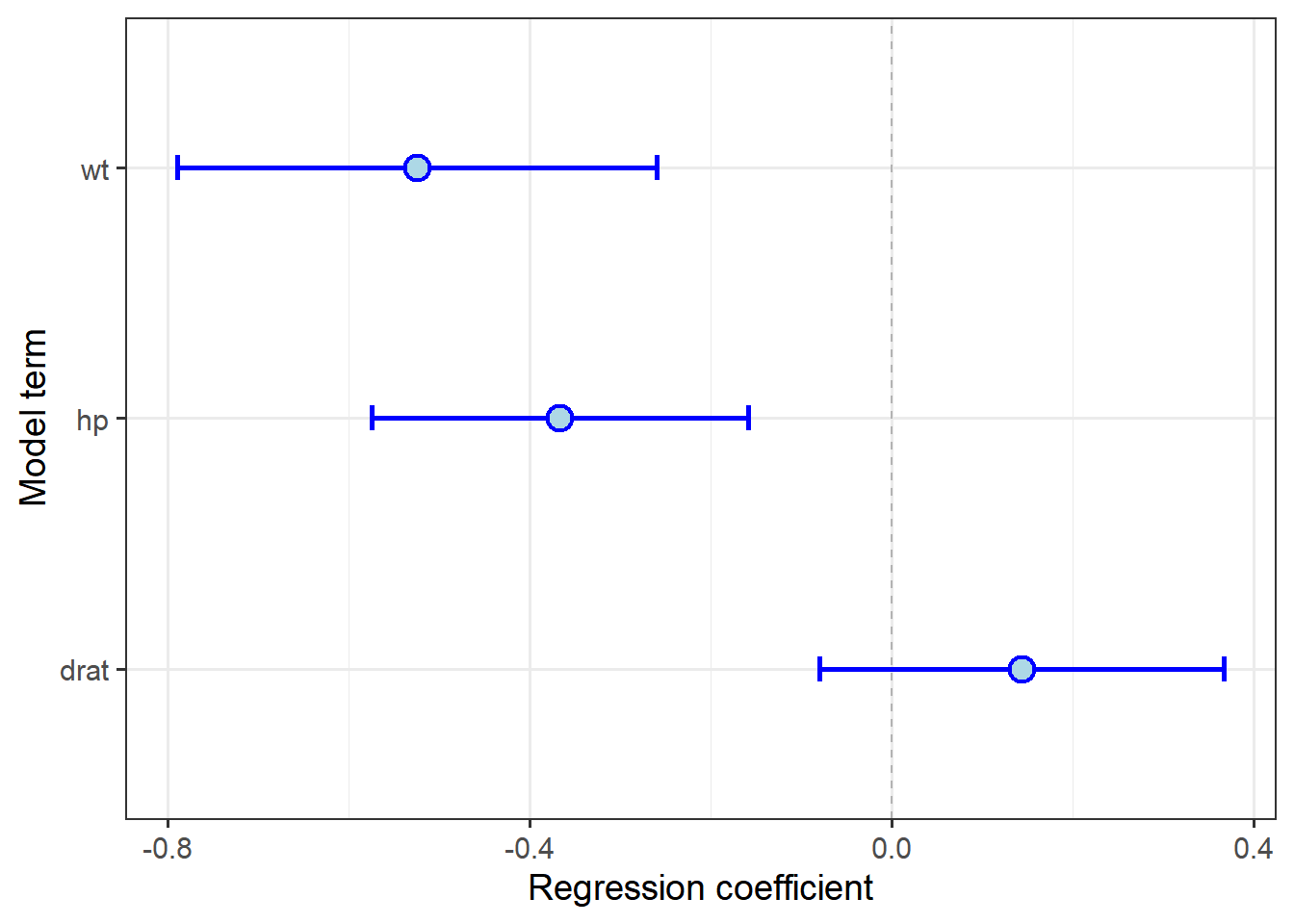
This gives us a much different picture of the relative effect of weight and horsepower. When plotting CIs, it is more important to consider scaling data prior to fitting the model, because the visual impact of the plot will be relative values, not just rank.
Continuous + categorical variables
While multiple continuous explantory variables are often tested together to determine their relative effects, additional categorical variables might be included to determine how the effects of predictor variables are conditioned by other variables, i.e., how does the response variable \(y\) change with \(x_1\) if \(x_2\) is held at a constant value? (One can also test how \(y\) changes as both \(x_1\) and \(x_2\) change by adding an interaction term; see below.)
For example, we know that fuel economy is affected by both transmission type and vehicle weight:
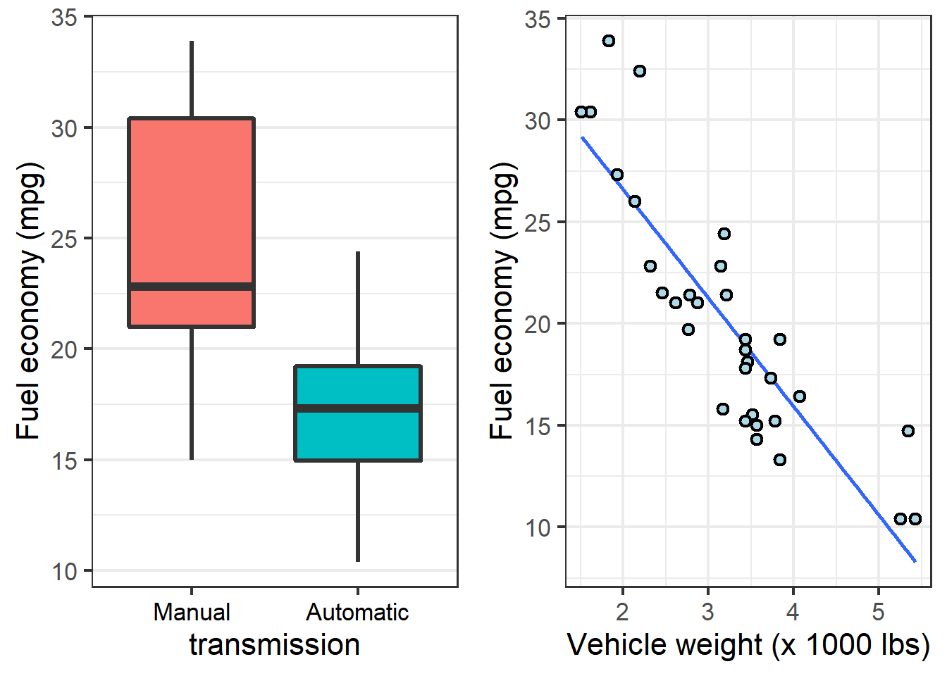
We might wonder, does the weight trend hold within each transmission type? Which variable is more important to fuel economy–a lighter car, or one with a manual transmission?
We can visualize the first question by adding the categorical variable as a conditional aesthetic in the scatterplot:
ggplot(mtcars,
           aes(x = wt,
               y = mpg)) + theme_bw(16) +
    geom_smooth(aes(color = transmission),
                method="lm", se = F) +
    geom_point(aes(fill=transmission),
               pch = 21, size =2, stroke = 1.1) +
    labs(y = "Fuel economy (mpg)",
         x = "Vehicle weight (x 1000 lbs)")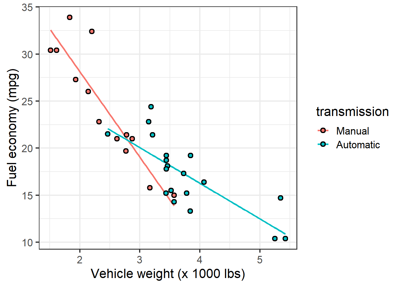
The plot indicates that for both transmission types, fuel economy declines as cars get heavier. The decline seems more drastic, however, for cars with manual transmissions.
Fit a linear model:
cat_lm <- lm(mpg ~ wt + transmission, mtcars)
summary(cat_lm)$coefficients %>%
pander::pander() | Estimate | Std. Error | t value | Pr(>|t|) | |
|---|---|---|---|---|
| (Intercept) | 37.3 | 2.086 | 17.88 | 3.326e-17 |
| wt | -5.353 | 0.7882 | -6.791 | 1.867e-07 |
| transmissionAutomatic | 0.02362 | 1.546 | 0.01528 | 0.9879 |
These results indicate that in a model that includes vehicle weight, transmission type does not have a significant effect on fuel economy.
Another way to determine whether a term is worth including in statistical models is to compare models with and without the term using the anova() function.
This method compares the Residual Sums of Squares (RSS) between the models; the lower the RSS, the better the model fits.
If the additional term is meaningful in explaining variation in the response variable, the models will be statistically-signficantly different. If the additional term does not add meaningful value, the models will not be different:
wt_lm <- lm(mpg ~ wt, mtcars)
anova(wt_lm, cat_lm)
## Analysis of Variance Table
##
## Model 1: mpg ~ wt
## Model 2: mpg ~ wt + transmission
## Res.Df RSS Df Sum of Sq F Pr(>F)
## 1 30 278.32
## 2 29 278.32 1 0.0022403 2e-04 0.9879These results confirm the above: adding the transmission term does not explain signficantly more variation in fuel economy than vehicle weight alone.
NOTE
Comparing linear models with anova() should be used sparingly.
Do not compare several models at once, nor models with substantially different numbers of terms. Adding terms changes the relationships between the models and their relative probabilities of including a particularly highly-explantory variable by chance, simply because there are many variables. Proper model selection methods use an information-theoretic criterion to rank models, and those methods typically have a means for taking the number of terms into account. We don’t cover it here, but it is covered elsewhere.
So why do cars with manual transmissions appear to have better fuel economy?
After considering all of these graphs, it appears that the reason is not that having the driver change gears saves energy, but that vehicles with manual transmissions simply tend to be lighter.
This illustrates an issue with testing hypotheses from observational data–the mtcars dataset does not provide a complete factorial design in which all vehicle weights are represented by both manual and automatic transmissions.
Really only then could we make a conclusive statement about which is more important about cars in general (beyond this specific dataset).
Interaction terms
While the statistics behind interactions are beyond the scope of this course, it is important to understand how to write script for them in R.
Always bear in mind that testing for an interaction between two terms in a model adds a term to the model, which reduces the degrees of freedom and thus reduces the statistical power of the model, which means one needs a larger test statistic value (\(t\) or \(F\)) to get a given \(P\) value. In general, I always tell students do not add an interaction term unless you have a specific hypothesis for it. Adding an interaction term to a model just because it is easy introduces a number of complications many students aren’t prepared for.
If one must, there are two ways to add an interaction term in R.
The easiest involves using * instead of + between the model terms:
lm(y ~ x1 * x2, data)However, this obscures the fact that a term is being added to the model (the formula only includes \(x_1\) and \(x_2\)).
The longer syntax helps one remember how the model is actually being altered:
lm(y ~ x1 + x2 + x1:x2, data)The model results are exactly the same, because the * is simply a shortcut for including each model term on its own and the interaction between \(x_1\) and \(x_2\), which is what x1:x2 specifies (the interaction between the terms only, no individual effect).
Because the slopes of the relationship between fuel economy and vehicle weight are a tad different between vehicles with automatic and manual transmissions, we might want to test for an interaction.
One can determine if an interaction term adds explanation of variation using the anova() method described above:
int_lm <- lm(mpg ~ wt + transmission + wt:transmission, mtcars)
anova(wt_lm, cat_lm, int_lm)
## Analysis of Variance Table
##
## Model 1: mpg ~ wt
## Model 2: mpg ~ wt + transmission
## Model 3: mpg ~ wt + transmission + wt:transmission
## Res.Df RSS Df Sum of Sq F Pr(>F)
## 1 30 278.32
## 2 29 278.32 1 0.002 0.0003 0.985556
## 3 28 188.01 1 90.312 13.4502 0.001017 **
## ---
## Signif. codes: 0 '***' 0.001 '**' 0.01 '*' 0.05 '.' 0.1 ' ' 1Again, we are looking to see if RSS declines as terms are added.
We already knew that adding transmission to the model with wt did not reduce the RSS, but adding the interaction between them did.
Interpreting significant interaction terms is tricky. In general, the presence of a significant interaction term means that the main effects – the individual relationships between \(y\) and \(x_1\) and \(x_2\) – can no longer be assumed to be straightforward. The significant interaction term means that the effect of \(x_1\) on \(y\) depends on what the value of \(x_2\). One cannot simply say, As \(x_1\) changes by so many units, \(y\) changes by so many units; one must consider also the value of \(x_2\) at any given value of \(x_1\) before being able to make a statement about \(y\).
If the effect of changing \(x_2\) is to reverse the relationship between \(y\) and \(x_1\), one has a crossed or non-ordinal interaction and cannot really say anything meaningful about the main effect (\(x_1\) or \(x_2\)). Without doing something fancy, the analysis and interpretation pretty much grinds to a halt.
In this case, however, we can see from the data that the effects aren’t close to reversed (e.g., one group has negative slope, the other has positive slope). We’ve already observed a difference in the angle of the slopes across the transmission types, and this result confirms the angles are statistically signficantly different. Thus, we can continue with our analysis, with more insight than we had before. For example, we can update the conclusion fuel economy declines as cars get heavier to say fuel economy declines as cars get heavier, and the decline is greatest among cars with manual transmissions.