This lesson is broken into two parts, with a single homework assignment. This post covers Part 1: Basic mapping with ggplot2
Walking through the script
Packages
Handling spatial data
These dependency packages need to be installed so various functions from them can be used in the background, but we won’t call many of them directly:
pacman::p_load(maps, mapproj, rgeos)Our work will primarily be done through the familiar tidyverse way of writing script:
pacman::p_load(tidyverse, sf)Basic ggplot maps
maps data
The maps package provides a simple set of moderate-resolution world map data.
ggplot2 provides the map_data function, which will pull out a specific scope of data from the maps data (e.g., region = 'world', region = 'usa', etc.) and add it to the global environment in a ggplot-friendly object:
world <- map_data("world")
class(world)
## [1] "data.frame"world %>%
as_tibble ## # A tibble: 99,338 x 6
## long lat group order region subregion
## <dbl> <dbl> <dbl> <int> <chr> <chr>
## 1 -69.9 12.5 1 1 Aruba <NA>
## 2 -69.9 12.4 1 2 Aruba <NA>
## 3 -69.9 12.4 1 3 Aruba <NA>
## 4 -70.0 12.5 1 4 Aruba <NA>
## 5 -70.1 12.5 1 5 Aruba <NA>
## 6 -70.1 12.6 1 6 Aruba <NA>
## 7 -70.0 12.6 1 7 Aruba <NA>
## 8 -70.0 12.6 1 8 Aruba <NA>
## 9 -69.9 12.5 1 9 Aruba <NA>
## 10 -69.9 12.5 1 10 Aruba <NA>
## # ... with 99,328 more rowsAdding features
The key to making a ggplot map is the group= aesthetic.
geom_path gives a simple outline of the features:
ggplot(world) +
  geom_path(aes(x=long, y=lat, group=group))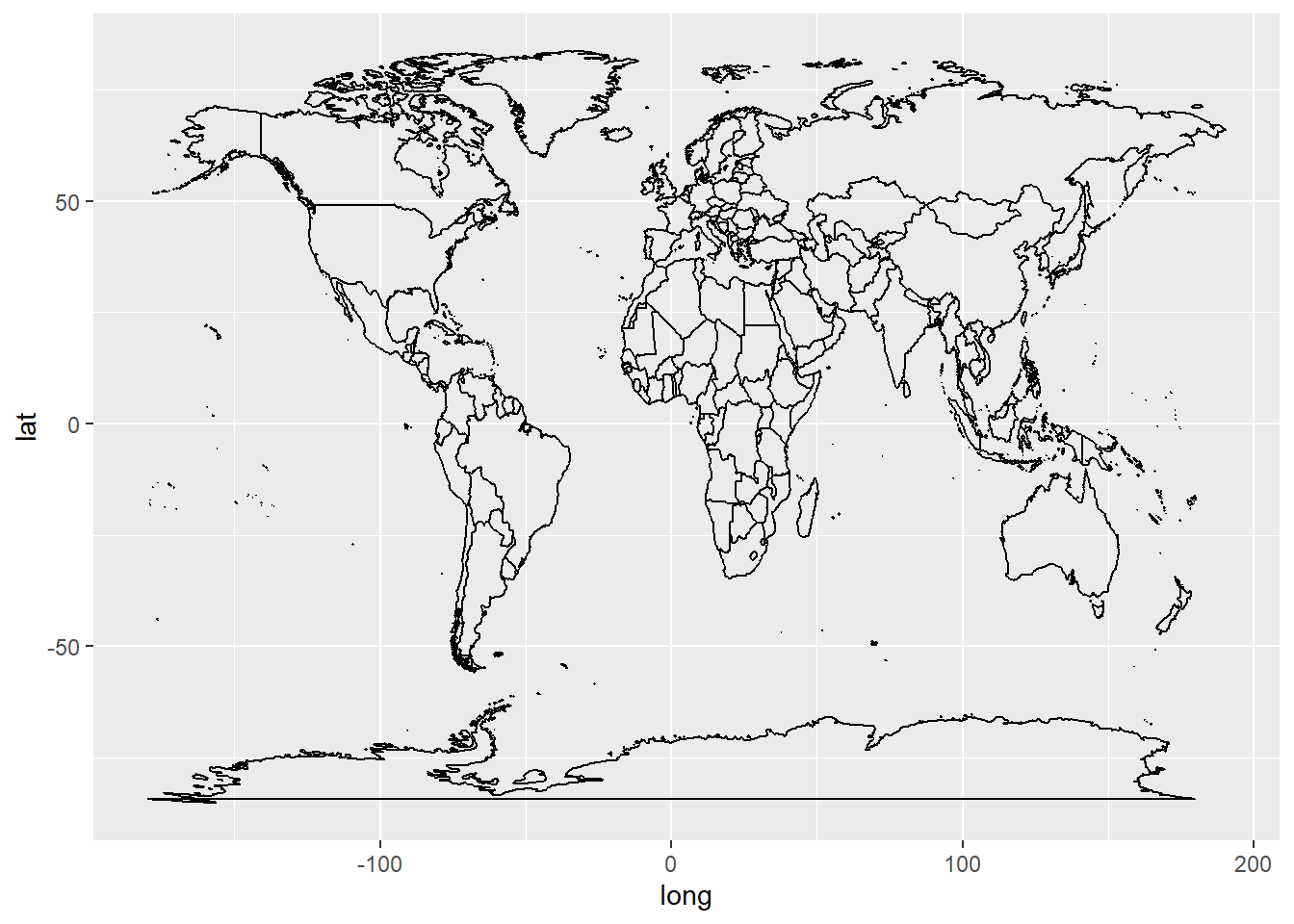
geom_polygon allows control over both outline and fill.
It can be slower than geom_path but allows more control over how features appear.
world %>%
  filter(region == "Canada") %>%
    ggplot() +
      geom_polygon(aes(x=long, y=lat, group=group),
                fill="red")
Coordinate Reference Systems
While it is conceptually easy to envision using a graphics package like ggplot2 to make maps on the understanding that map data are simple \(x\), \(y\) coordinates, in reality this is complicated by the fact that the Earth’s surface is not a simple Cartesian \(x\), \(y\) plane in which (1) both axes have the same units and (2) the size of the units is consistent across the range of the axis. Rather, the Earth’s surface is rounded and it isn’t a sphere, so there are more degrees of longitude than there are latitude, and a degree of longitude spans a much greater range at the equator than when the longitude lines taper in together at the poles.
Map projections are a tool to account for 3D realities in 2D representations. Understanding projections is a core aspect of using maps in the field as well as making them with a Geographic Information System (GIS), which we are now expecting \({\bf\textsf{R}}\) and ggplot2 to perform as.
The Coordinate Reference System, or CRS, defines the map projection in the GIS. It gives a reference for both how spatial data were collected from the Earth’s surface as well as how those data must be projected onto a map. For the most part, projecting data in a CRS different from what they were collected in makes for non-sensical maps and often prompts protest from the GIS. \({\bf\textsf{R}}\) accommodates various CRS in various packages and as long as the CRS is defined correctly and familiar to an \({\bf\textsf{R}}\) package, it is easy to convert between different CRS (and thus easy to combine data collected in different ways onto the same map).
ggplot2 offers coord_map() to make sure ggplot knows this is not a simple \(x\), \(y\) data graph, and overrides the default Cartesian projection (coord_cartesian()).
world %>%
  filter(region == "Canada") %>%
  ggplot() +
  geom_polygon(aes(x=long, y=lat, group=group),
               fill="red") +
coord_map() 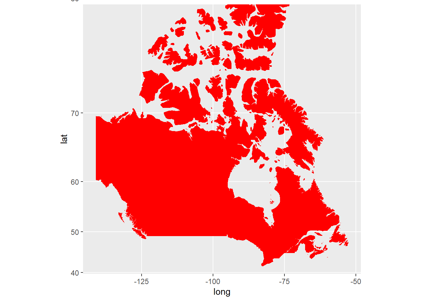
This map is different than the one above because the default Cartesian projection makes incorrect assumptions about degrees latitude and longitude as consistently-sized units.
It is through arguments to coord_map() that one changes the CRS.1
Canada is a useful example because it is very wide (spans a lot of longitude) but also very high in latitude (nearly extends to the North Pole).
Thus, one can clearly see the effect of using a projection that accounts for the fact that longitude lines converge at the North Pole:
world %>%
  filter(region == "Canada") %>%
  ggplot() +
  geom_polygon(aes(x=long, y=lat, group=group),
               fill="red") +
coord_map("polyconic") 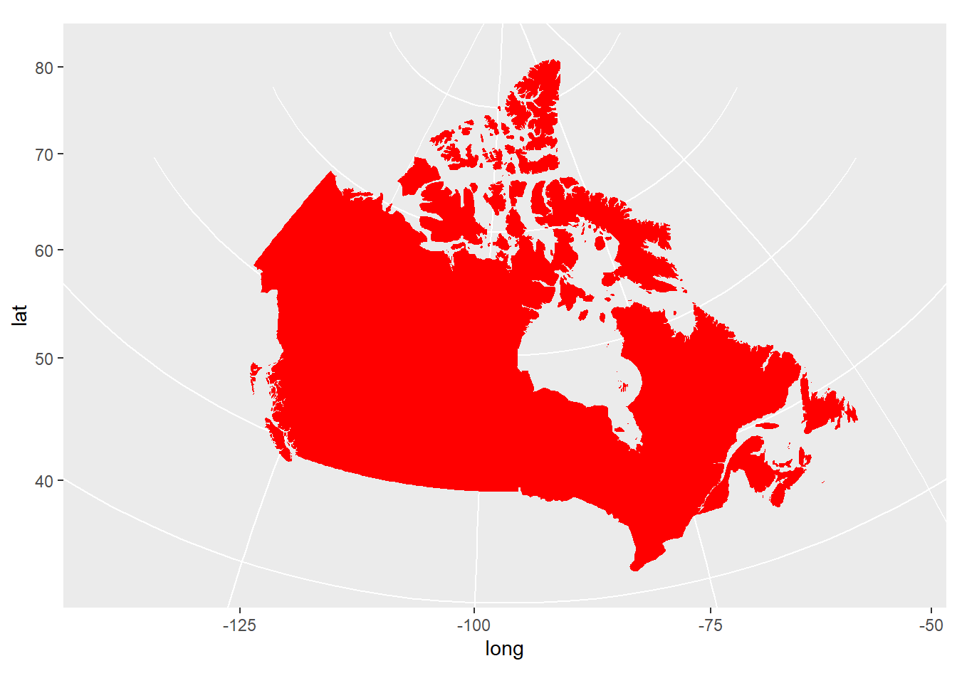
This in many ways is the most accurate map in terms of representing land area and distances between points on the Earth’s surface. Note how the northernmost islands are considerably closer together, and appear smaller.
The sf package
The sf package represents a major contribution to user-friendly solutions for using \({\bf\textsf{R}}\) to make maps with ggplot2. While it is not a perfect or entirely complete solution, it is more than sufficient for the purposes of an introduction to mapping in \({\bf\textsf{R}}\) that we can use it exclusively here.
sf makes two major improvements over previous workflows for mapping with ggplot2:
- sf automatically handles geospatial data objects in a tidy way.
As we know,
ggplotrequiresdata.frame-like objects, includingtibbles. Geospatial objects like shapefiles are not simple flat objects–they have different ‘slots’ for different types of information. It used to be kind of a pain to combine geographic info with data info into a flatdata.frameforggplot; sf handles this automatically. - sf is designed to integrate geospatial analysis and mapping tools with tidyverse data-wrangling workflows, so it is easy to
filterandmutateandjoindata as if we were doing any tidy data manipulation, including pipes%>%.
Geometry
A key element of an sf object is the geometry column.
It identifies the type of a vector feature–point, line, or polygon–and collapses all the vertices in a single vector, which combines all points in the feature into a single row and eliminates the need for the group aesthetic.
If the data are not stored in a spatial object, sf must be told where in the flat data.frame object to find the spatial information via a function that converts ‘foreign’ objects to sf:
world %>%
  st_as_sf(coords = c("long", "lat"))
## Simple feature collection with 99338 features and 4 fields
## geometry type: POINT
## dimension: XY
## bbox: xmin: -180 ymin: -85.19218 xmax: 190.2708 ymax: 83.59961
## CRS: NA
## First 10 features:
## group order region subregion geometry
## 1 1 1 Aruba <NA> POINT (-69.89912 12.452)
## 2 1 2 Aruba <NA> POINT (-69.89571 12.423)
## 3 1 3 Aruba <NA> POINT (-69.94219 12.43853)
## 4 1 4 Aruba <NA> POINT (-70.00415 12.50049)
## 5 1 5 Aruba <NA> POINT (-70.06612 12.54697)
## 6 1 6 Aruba <NA> POINT (-70.05088 12.59707)
## 7 1 7 Aruba <NA> POINT (-70.03511 12.61411)
## 8 1 8 Aruba <NA> POINT (-69.97314 12.56763)
## 9 1 9 Aruba <NA> POINT (-69.91181 12.48047)
## 10 1 10 Aruba <NA> POINT (-69.89912 12.452)geom_sf
For mapping, sf provides the specialized geom_sf.
It handles a lot of stuff automatically– i.e. it reads geometry to determine if it should plot a point, polygon, or line, and automatically grabs essential aesthetics: group, x, y.
It also knows the map projection, as it stores CRS in a header of the tidy object, so one does not use coord_map.
world %>%
  filter(region == "Canada") %>%
    st_as_sf(coords = c("long", "lat")) %>%
  ggplot() +
geom_sf() 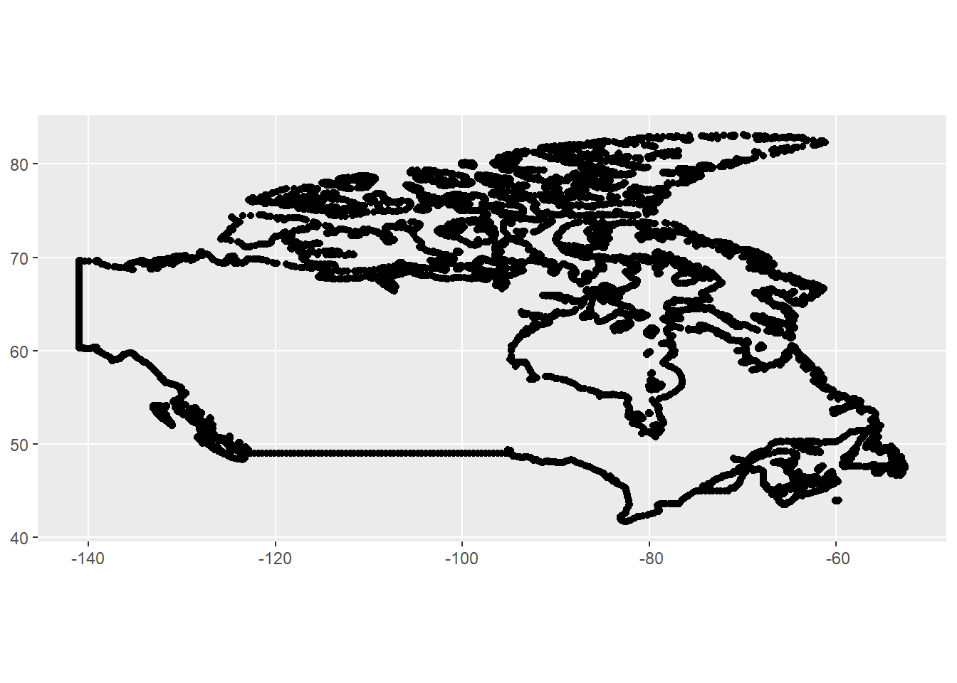
CRS
The map plotted, but the geometry is essentially unitless because the data are not associated with a specific projection; note CRS: NA in the header below:
world %>%
  filter(region == "Canada") %>%
    st_as_sf(coords = c("long", "lat"))
## Simple feature collection with 11573 features and 4 fields
## geometry type: POINT
## dimension: XY
## bbox: xmin: -141.0022 ymin: 41.67485 xmax: -52.65366 ymax: 83.11611
## CRS: NA
## First 10 features:
## group order region subregion geometry
## 1 245 14759 Canada Sable Island POINT (-59.7876 43.9396)
## 2 245 14760 Canada Sable Island POINT (-59.92227 43.90391)
## 3 245 14761 Canada Sable Island POINT (-60.03775 43.90664)
## 4 245 14762 Canada Sable Island POINT (-60.11426 43.93911)
## 5 245 14763 Canada Sable Island POINT (-60.11748 43.95337)
## 6 245 14764 Canada Sable Island POINT (-59.93604 43.9396)
## 7 245 14765 Canada Sable Island POINT (-59.86636 43.94717)
## 8 245 14766 Canada Sable Island POINT (-59.72715 44.00283)
## 9 245 14767 Canada Sable Island POINT (-59.7876 43.9396)
## 10 246 14769 Canada 5 POINT (-66.27377 44.29229)The empty CRS is not necessarily a problem, but it will be if one wants to combine different data stored under different CRS. All data will need to be stored as a common CRS. sf is smart, but it can’t convert to something if it doesn’t know what it is coming from.
Setting the projection of an incoming data.frame is easy at the point of conversion to an sf object, right when the geometry is identified.
It is important that the projection be set to that under which the data are stored, not as one might desire them to be in the final map product.
This of course requires one to know what the original CRS was, which is easy to lose in a flat data.frame.
There are (at least) two ways to identify a CRS: each has a name, and a code assigned by what was known at the time as the European Petroleum Survey Group, or EPSG. sf seems to work best (only?) on EPSG codes, which make for shorter script but aren’t intuitive.
The maps data are stored in the common longitude-latitude format used by consumer-grade GPS units and many map/navigation apps called World Geodetic System 1984, or WGS 84.
The EPSG code for WGS 84 is \(\textsf{4326}\),
so we add the argument crs=4326 to identify the original projection the data are stored under:
world %>%
  filter(region == "Canada") %>%
    st_as_sf(coords = c("long", "lat"), crs=4326)
## Simple feature collection with 11573 features and 4 fields
## geometry type: POINT
## dimension: XY
## bbox: xmin: -141.0022 ymin: 41.67485 xmax: -52.65366 ymax: 83.11611
## geographic CRS: WGS 84
## First 10 features:
## group order region subregion geometry
## 1 245 14759 Canada Sable Island POINT (-59.7876 43.9396)
## 2 245 14760 Canada Sable Island POINT (-59.92227 43.90391)
## 3 245 14761 Canada Sable Island POINT (-60.03775 43.90664)
## 4 245 14762 Canada Sable Island POINT (-60.11426 43.93911)
## 5 245 14763 Canada Sable Island POINT (-60.11748 43.95337)
## 6 245 14764 Canada Sable Island POINT (-59.93604 43.9396)
## 7 245 14765 Canada Sable Island POINT (-59.86636 43.94717)
## 8 245 14766 Canada Sable Island POINT (-59.72715 44.00283)
## 9 245 14767 Canada Sable Island POINT (-59.7876 43.9396)
## 10 246 14769 Canada 5 POINT (-66.27377 44.29229)Note now the CRS field is populated with \(\textsf{WGS 84}\).
Once a CRS is assigned, the st_transform function can convert it to another.
Here we give it a variation on WGS 84 used by Google Maps and OpenStreetMap, the Pseudo-Mercator, or EPSG \(\textsf{3857}\):
world %>%
  filter(region == "Canada") %>%
    st_as_sf(coords = c("long", "lat"), crs=4326) %>%
      st_transform(3857)
## Simple feature collection with 11573 features and 4 fields
## geometry type: POINT
## dimension: XY
## bbox: xmin: -15696290 ymin: 5112398 xmax: -5861379 ymax: 17928860
## projected CRS: WGS 84 / Pseudo-Mercator
## First 10 features:
## group order region subregion geometry
## 1 245 14759 Canada Sable Island POINT (-6655525 5456100)
## 2 245 14760 Canada Sable Island POINT (-6670516 5450584)
## 3 245 14761 Canada Sable Island POINT (-6683371 5451006)
## 4 245 14762 Canada Sable Island POINT (-6691889 5456025)
## 5 245 14763 Canada Sable Island POINT (-6692247 5458229)
## 6 245 14764 Canada Sable Island POINT (-6672049 5456100)
## 7 245 14765 Canada Sable Island POINT (-6664292 5457270)
## 8 245 14766 Canada Sable Island POINT (-6648796 5465880)
## 9 245 14767 Canada Sable Island POINT (-6655525 5456100)
## 10 246 14769 Canada 5 POINT (-7377563 5510786)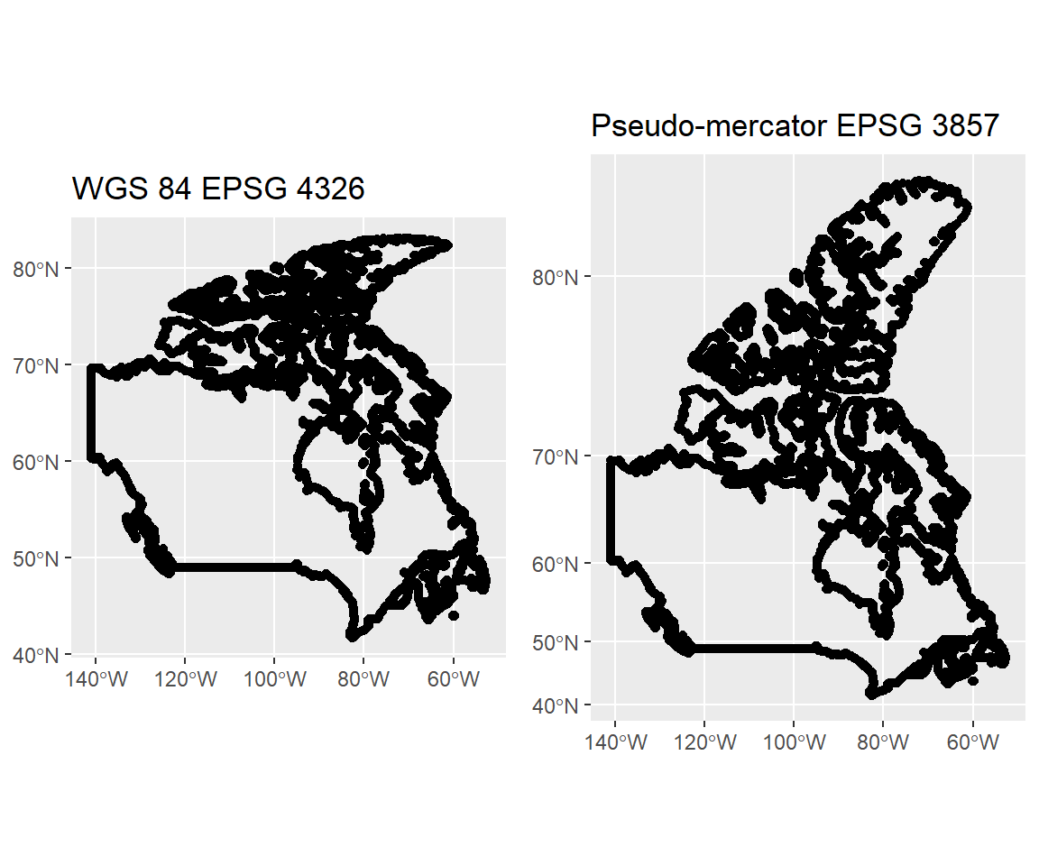
This view of Canada illustrates a central critique of Mercator projections: polar areas are elongated and appear larger than they actually are (notice how the space between the Y axis tick marks increases every 10 degrees). The Mercator projection was developed for sea navigation but became popular for wall maps in the colonial area. One wonders if folks in tiny European countries felt more important to look up and see the size of their homelands exagerated and the apparent size of their tropical colonies diminished.
Natural Earth data
To make a map, one must have spatially-explicit data. One can often collect unique features in the field with a GPS unit, or using remotely-sensed products in a GIS. But adding to a map shapes and areas like countries and counties, points like cities and towns, and lines like roads and rivers would be prohibitively laborious if one had to enter or digitize everything oneself.
Fortunately there are many sources of freely-available map data online.2 While the maps package provides some simple polygons, the level of detail is not terribly high.
The Natural Earth project provides several freely-available products at a global scale, each with all sorts of natural, political, and economic information for various features.
Natural Earth data are set up well for use in \({\bf\textsf{R}}\) and there are a couple packages that facilitate the connection between one’s active \({\bf\textsf{R}}\) session and the database.3
pacman::p_load(rnaturalearth, rnaturalearthdata)\(\textsf{R-Natural Earth}\) functions play well with sf.
Here, use ne_countries to download information about Canada as an sf object:
canada_sf <- ne_countries(country = "Canada",
                          returnclass = "sf")
In querying the sf object, we can see that it contains a lot of information about Canada:
names(canada_sf)## [1] "scalerank" "featurecla" "labelrank" "sovereignt" "sov_a3"
## [6] "adm0_dif" "level" "type" "admin" "adm0_a3"
## [11] "geou_dif" "geounit" "gu_a3" "su_dif" "subunit"
## [16] "su_a3" "brk_diff" "name" "name_long" "brk_a3"
## [21] "brk_name" "brk_group" "abbrev" "postal" "formal_en"
## [26] "formal_fr" "note_adm0" "note_brk" "name_sort" "name_alt"
## [31] "mapcolor7" "mapcolor8" "mapcolor9" "mapcolor13" "pop_est"
## [36] "gdp_md_est" "pop_year" "lastcensus" "gdp_year" "economy"
## [41] "income_grp" "wikipedia" "fips_10" "iso_a2" "iso_a3"
## [46] "iso_n3" "un_a3" "wb_a2" "wb_a3" "woe_id"
## [51] "adm0_a3_is" "adm0_a3_us" "adm0_a3_un" "adm0_a3_wb" "continent"
## [56] "region_un" "subregion" "region_wb" "name_len" "long_len"
## [61] "abbrev_len" "tiny" "homepart" "geometry"These columns can be used for analyses that seek to compare different countries in the overall dataset. The variables are both categorical and continuous. For example, Canada is a developed country that is part of the Group of Seven economic organization:
canada_sf$economy## [1] "1. Developed region: G7"And we can also use the total population of the country in some sort of comparison or analysis:
canada_sf$pop_est## [1] 33487208It is very simple to make a nice map from Natural earth data using geom_sf; it just takes two lines of code and only one given argument:
ggplot(canada_sf) +
geom_sf() 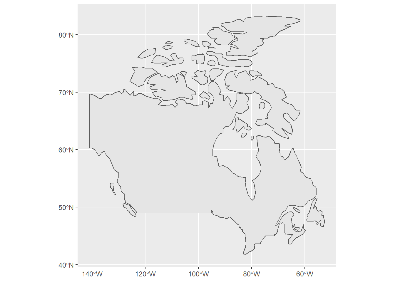
And it doesn’t take too much extra work to make our product look less like a graph and more like a custom map:
canada_sf %>%
 st_transform(26913) %>%
ggplot() + theme_bw() +
  geom_sf(fill="red") +
  theme(axis.text = element_blank(),
        axis.ticks = element_blank())
Homework assignment
(Complete the second part of the lesson first)
At least, when making the map. Other functions are available to change the CRS of the underlying data; we use
st_transformin this lesson.↩There is also a lot that is proprietary and can be purchased as a once-off download or on a subscription basis, but we aren’t going there in this course.↩
One can also download the entire dataset once and access it locally from there on; we cover this in a later lesson.↩