Objectives
The script and exercises for this week introduce new users to the ggplot2 package:
- Core components of the basic
ggplot()call - Adding information one variable at a time via
aes()andfacet_* - Formatting and themes
Online resources
Here are some helpful resources for learning how to use ggplot and just thinking about graphing, in general.
ggplot2 how-to pages
Walking through the script
Package loading
We’ll load ggplot2 by itself. It lives in the tidyverse, which we will typically load because and since we often use other tidyverse functions, but here let’s focus on ggplot2.
Remember that in an R markdown file, you need to include the package loading even if you have it loaded in the session. R markdown files are like self-contained \({\bf\textsf{R}}\) sessions, so it only knows what you tell it. If you need a function from a package in a code chunk, be sure to load the package first.
pacman::p_load(ggplot2)Data loading
This script uses the mtcars2 dataset created in the previous lesson.
This time there are three options:
Either load it from the .Rdata object you saved at the end of the previous lesson…
setwd(".../R")
mtcars2 <- load("./data/mtcars2.Rdata)
… or read from a .Rdata object on GitHub…
objURL = url("https://github.com/devanmcg/IntroRangeR/raw/master/data/mtcars2.Rdata")
load(objURL)
…or read from a .csv on GitHub:
csvURL = url("https://github.com/devanmcg/IntroRangeR/raw/master/data/mtcars2.csv")
mtcars2 <- read.csv(csvURL)
Note:
To load files from GitHub into \({\bf\textsf{R}}\), URLs must include raw, not blob.
Now just check that we have the proper file:
str(mtcars2)## 'data.frame': 32 obs. of 17 variables:
## $ make.model : chr "Mazda RX4" "Mazda RX4 Wag" "Datsun 710" "Hornet 4 Drive" ...
## $ mpg : num 21 21 22.8 21.4 18.7 18.1 14.3 24.4 22.8 19.2 ...
## $ cyl : chr "6" "6" "4" "6" ...
## $ disp : num 160 160 108 258 360 ...
## $ hp : num 110 110 93 110 175 105 245 62 95 123 ...
## $ drat : num 3.9 3.9 3.85 3.08 3.15 2.76 3.21 3.69 3.92 3.92 ...
## $ wt : num 2.62 2.88 2.32 3.21 3.44 ...
## $ qsec : num 16.5 17 18.6 19.4 17 ...
## $ vs : chr "0" "0" "1" "1" ...
## $ transmission: chr "Manual" "Manual" "Manual" "Automatic" ...
## $ gear : chr "4" "4" "4" "3" ...
## $ carb : chr "4" "4" "1" "1" ...
## $ make : Factor w/ 20 levels "AMC","Cadillac",..: 14 14 5 1 1 16 16 15 15 15 ...
## $ country : Factor w/ 6 levels "Germany","Italy",..: 3 3 3 6 6 6 6 1 1 1 ...
## $ origin : chr "foreign" "foreign" "foreign" "domestic" ...
## $ continent : chr "Asia" "Asia" "Asia" "North America" ...
## $ sportiness : chr "Kinda sporty" "Not sporty" "Kinda sporty" "Not sporty" ...Introducing ggplot
The ggplot() function lives in the ggplot2 package, which now comes bundled in tidyverse.
Creating a plot is simple given the default settings of the ggplot() function, which is programmed to take care of a lot of aesthetic formatting and stuff.
Almost every single default can be overwritten, and with a high degree of specificity.
As such, despite high-level defaults, ggplot() graphs are very customizable.
Doing so can make for lengthy ggplot() calls.
Like tidyverse, ggplot2 is kind of its own little dialect of \({\bf\textsf{R}}\).
The main pieces of a call to ggplot() are separated by plus signs +, which should almost always be followed by a line break.
Arguments are separated by commas, which can precede line breaks as in the rest of \({\bf\textsf{R}}\).
There are four main components to a call to ggplot():
- First (and always first), call the main plotting function,
ggplot() - Specify a
data.frameortibble - Identify aesthetics – the variables to be plotted – with
aes() - Define a geometry – how the plot should look – with
geom_
Here are a couple examples to illustrate how these components operate, and some of the variability in how a call to ggplot() can be constructed.
We’ll focus on the relationship between engine power (hp) and fuel economy (mpg) in our mtcars2 dataset.
Learning geom
This does not work…
ggplot(data=mtcars2, aes(x=hp, y=mpg)) 
… because we did not specify a geometry.
Because we have defined two continuous variables in aes(), we want to use a scatterplot, so we add geom_point with a +:
ggplot(data=mtcars2, aes(x=hp, y=mpg)) +
geom_point() 
ggplot2 is object-oriented.
This is useful when we build up plots:
ggp <- ggplot(data=mtcars2, aes(x=hp, y=mpg)) +
          geom_point()
ggp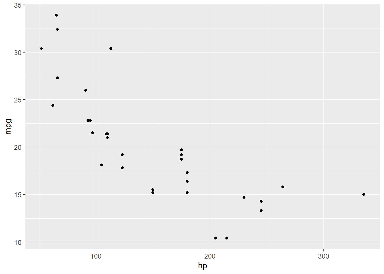
Now we can add a smoothed trendline using geom_smooth:
ggp + geom_smooth() ## `geom_smooth()` using method = 'loess' and formula 'y ~ x'
Notice the default is to provide a smoothed loess curve for < 1000 observations surrounded by a shaded 95% confidence interval.
?geom_smooth describes many options, including a method argument to define the type of trendline calculation and se for whether one wants to turn the shaded area off:
ggp + geom_smooth(method = 'lm', se = FALSE) 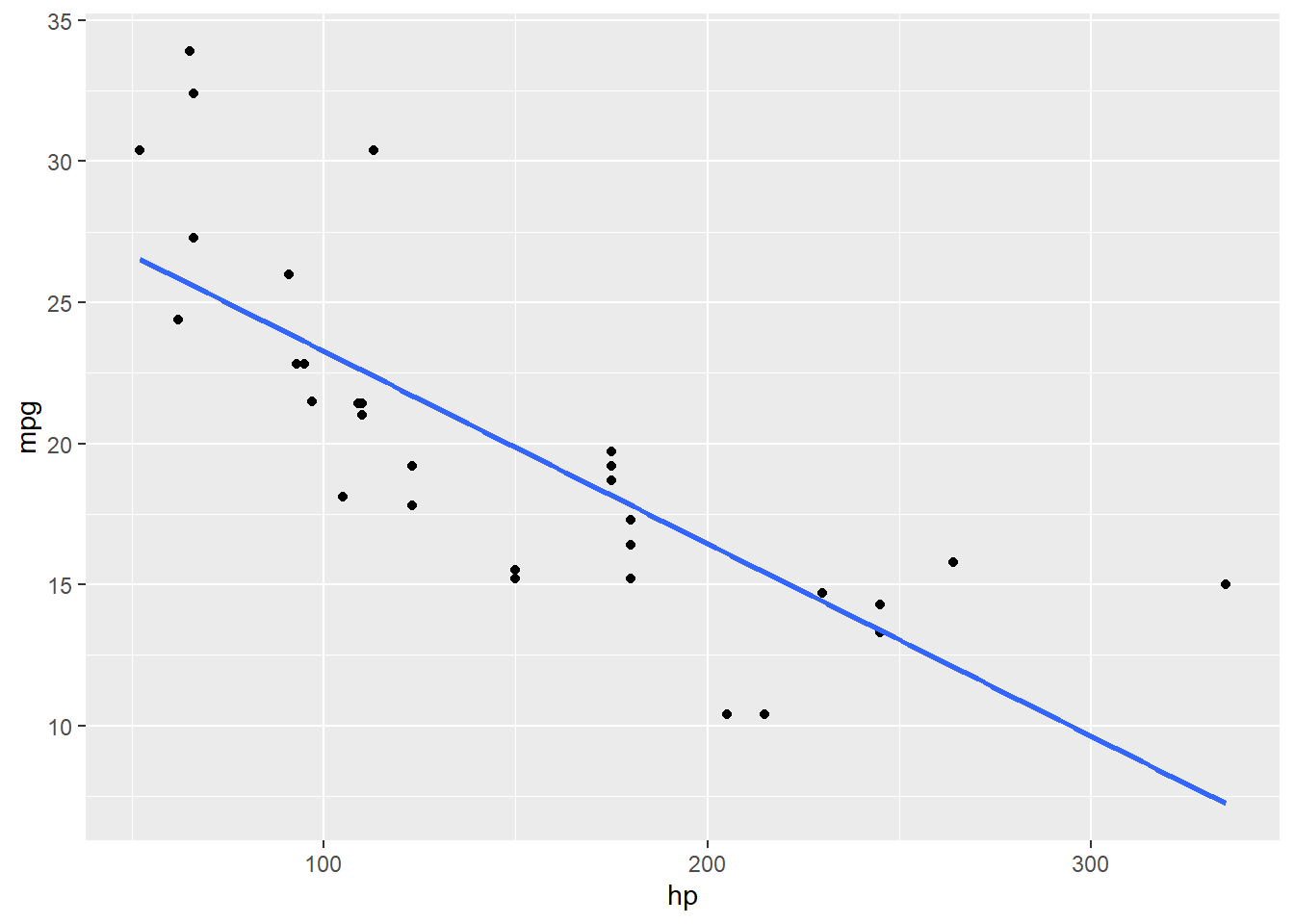
Component placement
Note that both data and aes() can be given in either the main ggplot() call or in the geom_.
Furthermore, data can be ‘piped’ in to ggplot() via %>%.
Note that data= must be used inside a geom_ but can be omitted inside ggplot().1
These produce identical results:
# 1
  ggplot(mtcars2, aes(x=hp, y=mpg)) +
    geom_point()
# 2
  ggplot() +
    geom_point(data=mtcars2, aes(x=hp, y=mpg))
# 3
  ggplot(mtcars2) +
    geom_point(aes(x=hp, y=mpg))
# 4
  mtcars2 %>%
    ggplot() +
      geom_point(aes(x=hp, y=mpg))
Adding information
A central tenet in the theory of making good graphs is maximizing information:ink ratios. The basic idea is, as long as you’re putting in a point, why not have that point convey as much information as possible?
Points in [X,Y] space convey two bits of information: the value along the X axis variable, and the value along the Y axis variable. We’re going to commit a certain amount of ink, or pixels, to making these points just to convey these two bits of information.
Adding variables to aes()
Adding additional information via the points is easy with ggplot: we simply add any additional variables in the dataset to aes() to specify the color and/or shape of each point.
First, we can represent the number of cylinders in each car’s engine via point shape; notice how ggplot automatically creates and adds a legend:
ggplot(mtcars2,
       aes(x=hp, y=mpg,
           shape=cyl)) +
    geom_point()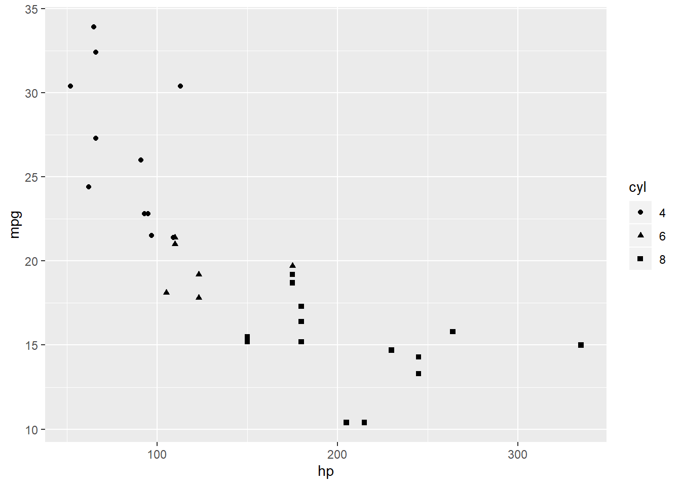
Perhaps even more visually appealing is separating the engines by color, as well:
ggplot(mtcars2,
       aes(x=hp, y=mpg,
           color=cyl,
           shape=cyl)) +
    geom_point()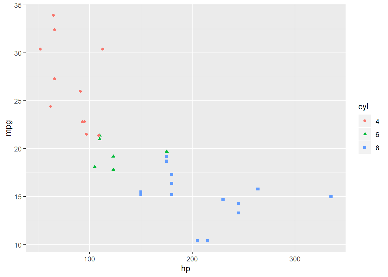
But maybe we’d prefer to convey another variable with one of those aesthetics:
ggplot(mtcars2,
       aes(x=hp, y=mpg,
           color=cyl,
           shape=transmission)) +
    geom_point()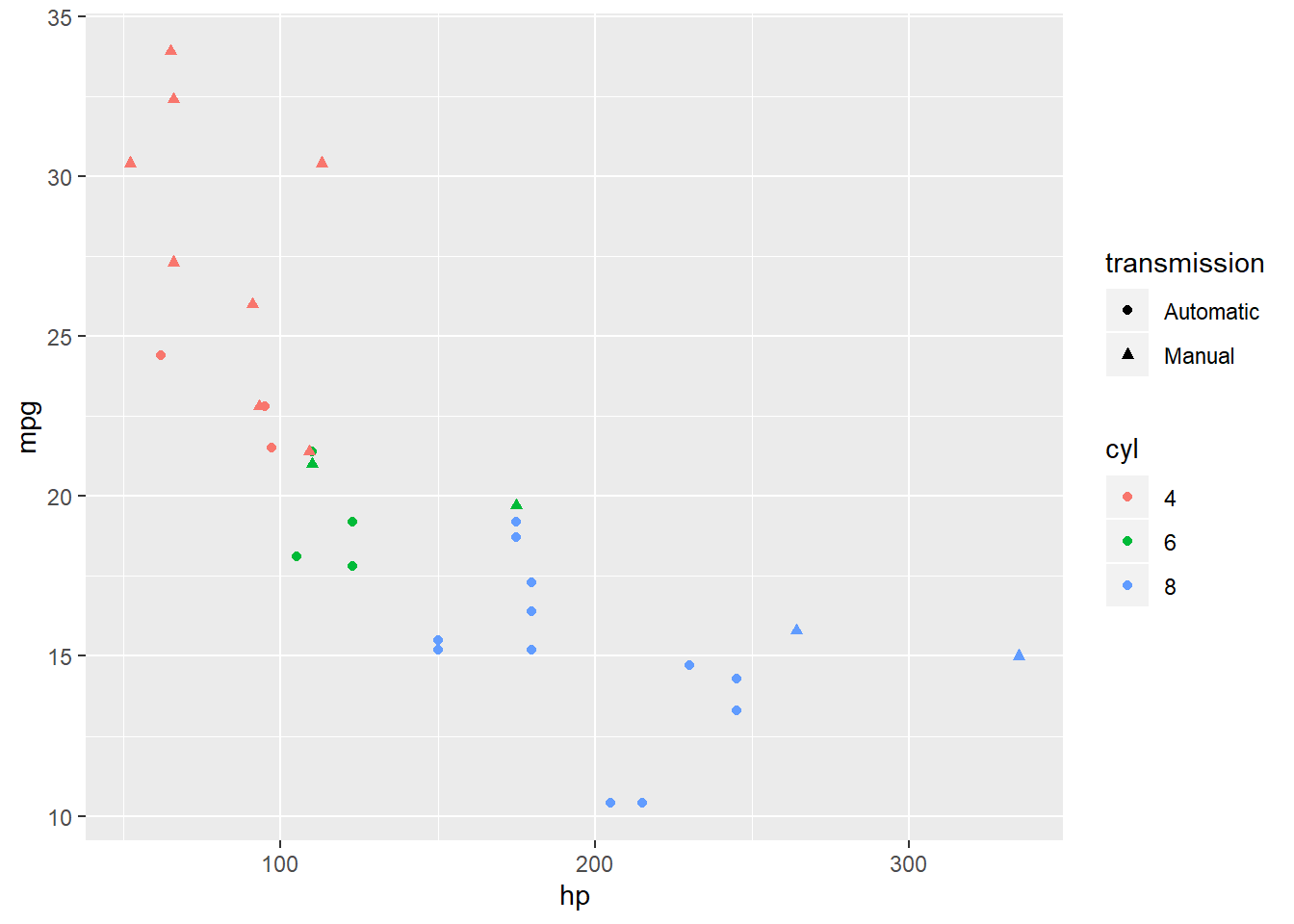
This scatterplot now conveys four bits of information–engine power & cylinder number, fuel economy, and transmission type–with the same number of points (and thus essentially the same amount of ink) as the first scatterplot.
Note the critical difference between these sets of plots:
ggplot(mtcars2) +
 geom_point(aes(x=hp, y=mpg,
                shape = cyl,
color = cyl)) 
ggplot(mtcars2) +
 geom_point(aes(x=hp, y=mpg,
                shape = cyl),
color = 'blue') 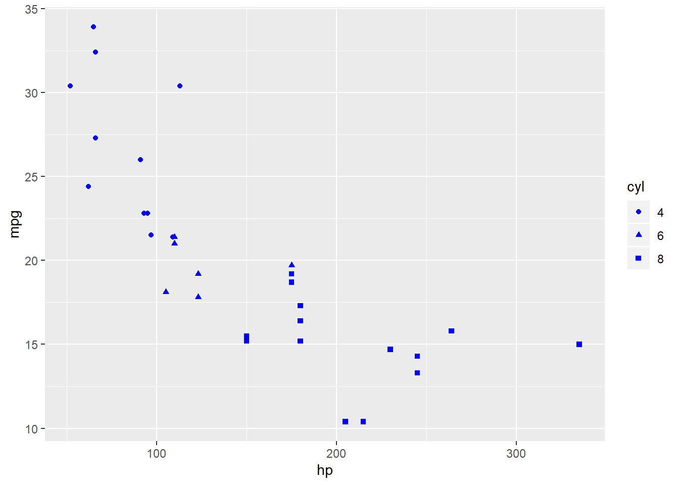
To change a component of the plot according to a variable in the dataset, the command must be included in aes().
Otherwise, changing a component will apply across the entire geom.
Pay careful attention to properly closing parentheses in ggplot, especially for aes() within a geom.
Using facets
Adding additional information to a single graph pane can be messy.
Fortunately, ggplot gives us several options to arrange our data in multiple panes, called facets, according to one or more (categorical) variables.
The simplest is facet_wrap, which just creates a unique plot window for data in each level of a categorical variable:
ggplot(mtcars2,
       aes(x=hp, y=mpg,
           color=cyl)) +
    geom_point() +
    facet_wrap(~transmission)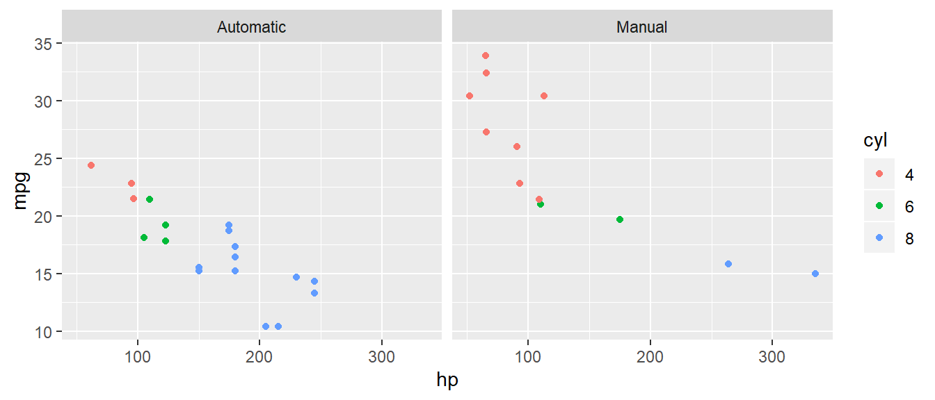
facet_grid plots levels of one variable against another:
ggplot(mtcars2,
       aes(x=hp, y=mpg,
           color=cyl)) +
    geom_point() +
    facet_grid(origin~transmission)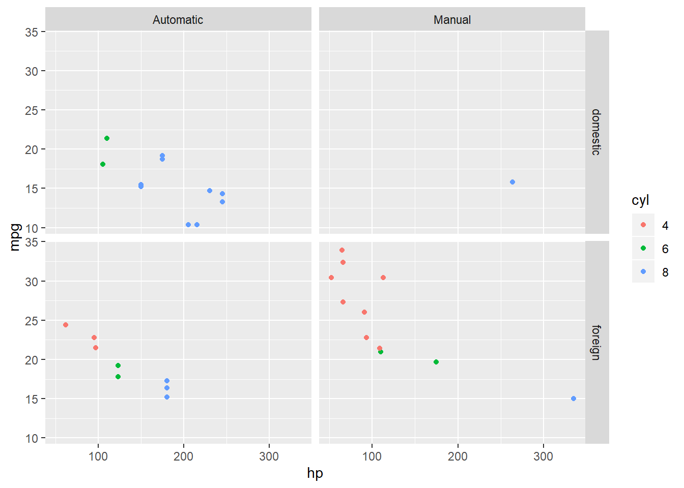
Note there is only one manual transmission model made in the USA in this snapshot of a few automobiles in 1974.
With panes and colors taking care of categorical variables, we can add a continuous variable, wt, to show the mass of cars via the relative size of the plotted points; i.e. larger points are heavier cars:
ggplot(mtcars2,
       aes(x=hp, y=mpg,
           color=cyl,
           size=wt)) +
    geom_point() +
    facet_grid(origin~transmission)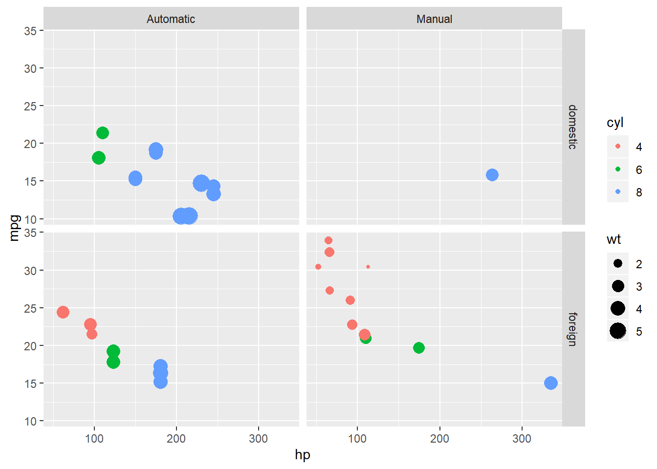
At this point we have six variables from the mtcars2 dataset in one plot with very little code.
Customizing ggplot appearance
scale_ settings
As we add more information, it is important that we tend to the clarity of the presentation.
The appearance of each variable in aes() can be modified via scale_ options. First, we help distinguish between overlapping points with outlines by manually specifying shape to pull values from the upper end of ?points, which allow one to define colors for both outline and fill:
 ggplot(mtcars2,
        aes(x=hp, y=mpg,
            color=cyl,
            shape=cyl,
            size=wt)) +
   geom_point()

 ggplot(mtcars2,
        aes(x=hp, y=mpg,
            fill=cyl,
            shape=cyl,
            size=wt)) +
   geom_point() +
   scale_shape_manual(values=c(21,22,24)) +
   scale_size_continuous(guide=FALSE)
Let’s also shut off the size legend and add a caption to indicate that point size simply scales with vehicle weight:
 ggplot(mtcars2,
        aes(x=hp, y=mpg,
            fill=cyl,
            shape=cyl,
            size=wt)) +
   geom_point() +
   scale_shape_manual(values=c(21,22,24)) +
   scale_size_continuous(guide=FALSE) +
   labs(caption = 'Point sizes scaled to show relative car weights')
There are actually more obvious graph components controlled by adding labs(); let’s make the axis labels more specific:
 ggplot(mtcars2,
        aes(x=hp, y=mpg,
            fill=cyl,
            shape=cyl,
            size=wt)) +
   geom_point() +
   scale_shape_manual(values=c(21,22,24)) +
   scale_size_continuous(guide=FALSE) +
   labs(x="Engine power (horsepower)",
        y="Fuel economy (miles/gallon)",
       caption = 'Point sizes scaled to show relative car weights')
Adjusting themes
There are two uses of “theme” in ggplot-speak.
First, there are a huge number of settings that relate to the size, orientation, and justification of almost every plot component (see ?theme).
We’ll play with just two here to enlarge a couple bits of text:
ggplot(data=mtcars2,
      aes(x=hp, y=mpg,
          fill=cyl,
          shape=cyl,
          size=wt)) +
 geom_point() +
 scale_shape_manual(values=c(21,22,24)) +
 scale_size_continuous(guide=FALSE) +
 theme(axis.title = element_text(size=14),
       axis.text = element_text(size=12))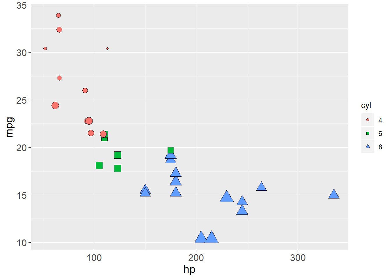
Next, there are some shortcuts for various theme settings that are added via theme_.
These calls generally modify the default theme and have two parts.
Firstly, what comes after theme_, such as theme_bw or theme_map, must be defined via (a) ggplot2 defaults, (b) a third-party loaded library, or (c) a user-defined object.
Secondly, a numeral in the parentheses, like (16), is a general modifier to the base font size of the theme.
It is a shortcut for adjusting the size of all text proportionally.
Let’s reuse the earlier ggp object and review themes:
ggp + theme_bw() # No background, major + minor gridlines
ggp + theme_linedraw() # No background, no minor gridlines
ggp + theme_minimal() # No axis lines 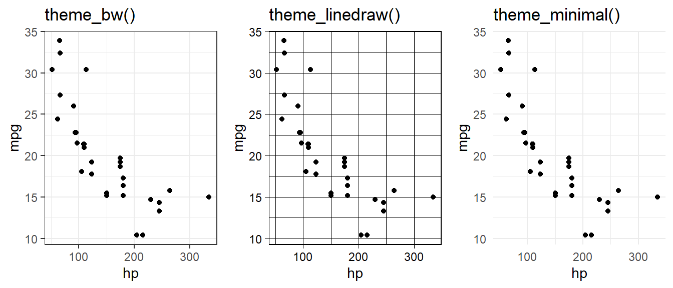
Here’s a final version of our information-maximized graph:
ggplot(mtcars2,
      aes(x=hp, y=mpg)) +
 geom_smooth(method="lm", color="black", se=FALSE) +
 geom_point(aes(fill=cyl,
                shape=cyl,
                size=wt)) +
 facet_grid(origin~transmission) +
 scale_shape_manual(name="Engine\ncylinders",
                    values=c(21,22,24)) +
 scale_fill_viridis_d(name="Engine\ncylinders") +
 scale_size_continuous(guide=FALSE) +
 labs(x="Engine power (horsepower)",
      y="Fuel economy (miles/gallon)",
      title="Fuel efficiency declines as engine power increases",
      caption="Point sizes scaled to car weight") +
theme_bw(16) 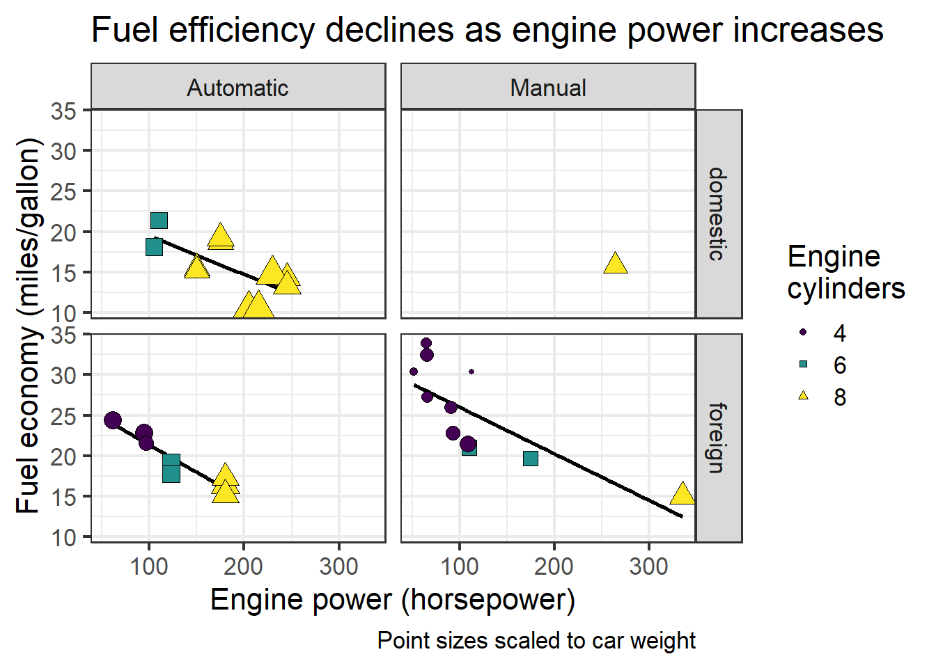
We won’t cover custom modification of themes here (other blogs do so), but we can check out a few that have been pre-packaged to mimic classic styles…
pacman::p_load(ggthemes)
  ggp + theme_wsj()   # Print like a Wall Street Journal graph
  ggp + theme_economist()  # Or one from the Economist
  ggp + theme_tufte()
… and those of other stats packages:
ggp + theme_stata() 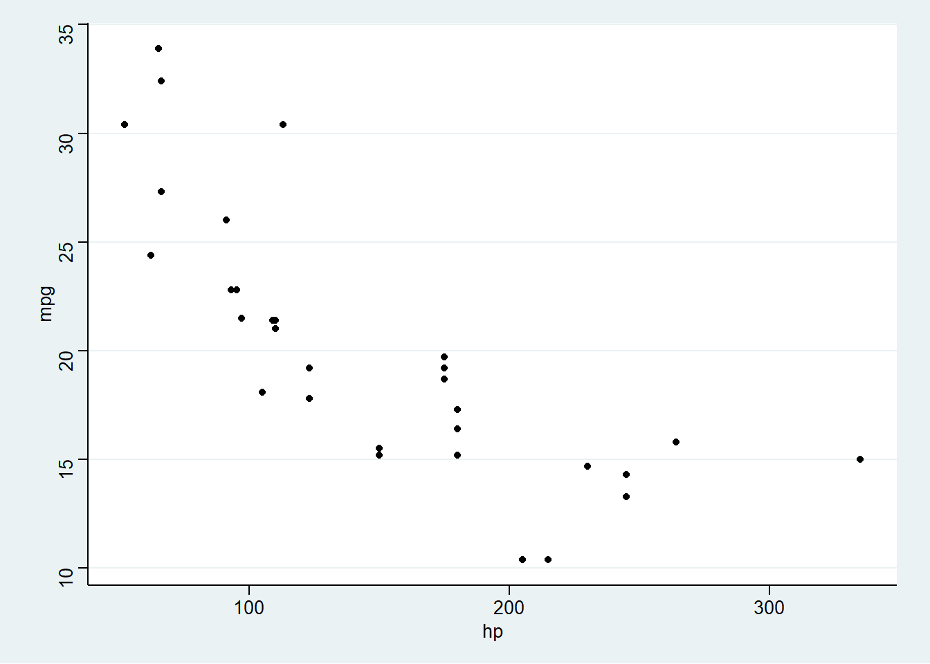
ggp + theme_excel() 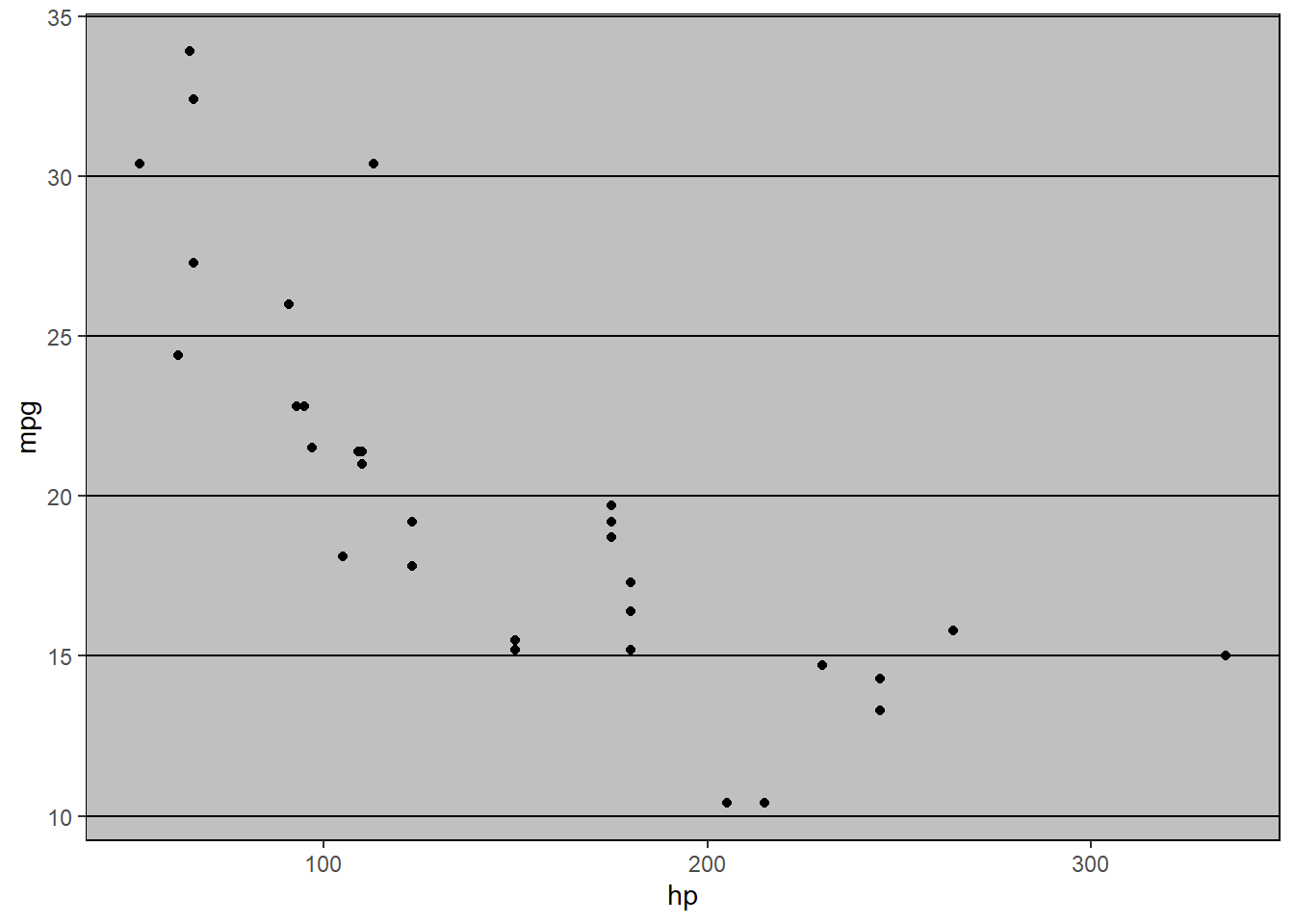
ggp + theme_base() 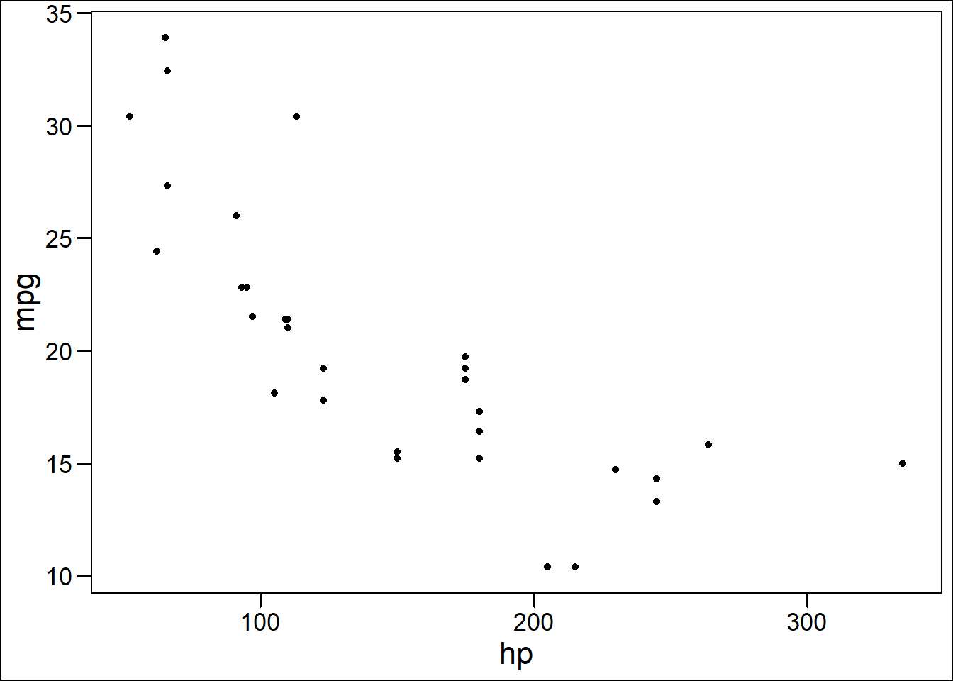
Homework
On that note,
x=andy=can apparently be omitted andggplot()will just assume the first two variables inaes()are meant to bexthenybut I never do this.↩