Overview
This lesson adapts a great blog post from Timo Grossenbacher on spatial interpolation into a lecture for IntroRangeR.
This excercise creates a map like this (Timo’s original)…

…from the data behind this map…

…which shows regional variations of certain dialects of a German word. Timo put this all together for his book, “Grüezi, Moin, Servus!”. Each point is the location of a person who selected a certain pronunciation in an online survey.
This document is an edited version of the original repository, which I’ve cloned and posted in my own repo. I’ve done all this under the original original MIT license, which has been retained.
Walking through the script
Some tips on using Natural Earth data
Preparations
Setup
Packages include:
tidyverse,sffor geodata processing,rnaturalearthfor political boundaries of Germanykknnfor categorical k-nearest-neighbor interpolationforeachanddoParallelfor parallel processing
Install and load packages
# Install packages
pacman::p_load(tidyverse, forcats, sf, rnaturalearth, kknn)
# Create a shorthand reference to Central European CRS
  crs_etrs = "+proj=utm +zone=32 +ellps=GRS80 +units=m +no_defs"
Load Data
Geometries
Political boundaries of Germany can be directly downloaded from
naturalearth.com with the rnaturalearth package.
The original script did not use returnclass = 'sf' and instead converted it later, and again later to data.frame; these updates use sf throughout.
This project uses the global admin_1 boundaries, from which German states are filtered.
# Original download
  admin1_10 <- ne_download(scale = 10,
                           type = 'states',
                           returnclass = 'sf',
                           category = 'cultural')
# I stored this as an R object to save time.
 load("input/NaturalEarthGlobalAdmin1_10_sf.RData")
 admin1_10 <- NaturalEarthGlobalAdmin1_10_sf
#
# filter to Germany & change projection
  german_st <- admin1_10 %>%
                filter(admin == 'Germany') %>%
                  st_transform(crs_etrs)
# Get rid of the original dataset, it is large
# and we don't need it any longer.
  rm(admin1_10)
# View the German states
  ggplot(german_st) +
    geom_sf(fill="white") +
    geom_sf_label(aes(label=name_en), size=3) +
    labs(title="English names for German states")
# Dissolve internal boundaries
  germany <-
    german_st %>%
      group_by(iso_a2) %>%
      summarize()
Point Data
The point data are loaded from a CSV file (phrase_7.csv).
It contains a random 150k sample of the whole data
set, which in turn encompassed around 700k points from the
German-speaking region of Europe (Germany, Austria, Switzerland, etc.).
# Download point data
#
# Survey data
#
  # Linguistic reference data
    lt_url = "https://raw.githubusercontent.com/devanmcg/categorical-spatial-interpolation/master/analysis/input/pronunciations.csv"
    lookup_table <- read_csv(lt_url,
                             col_names = c("pronunciation",
                                           "phrase",
                                           "verbatim",
                                           "nil")) %>%
                      filter(phrase == 7) # only the phrase we need
  # Survey responses
    resp_url = "https://github.com/devanmcg/categorical-spatial-interpolation/blob/master/analysis/input/phrase_7.csv?raw=true"
    responses <- read_csv(resp_url)
# Merge point data for Phrase 7
  responses <-
    responses %>%
      left_join(lookup_table,
                by = c("pronunciation_id" = "pronunciation")) %>%
        select(lat, lng, verbatim) %>%
          rename(pronunciation_id = verbatim) %>%
            mutate(pronunciation_id = as.factor(pronunciation_id))
  # Transform to sf object
    responses <-
      responses %>%
      st_as_sf(coords = c("lng", "lat"),
               crs = 4326) %>%
        st_transform(crs_etrs)
Cities
I also labelled some big German cities in the map to provide some orientation. These are available from simplemaps.com (there are certainly other data sets, this is just what a quick DuckDuckGo search revealed…).
# Cities data (from Simple Maps https://simplemaps.com/data/world-cities)
#
  # load & pre-process
    cit_url = "https://raw.githubusercontent.com/devanmcg/categorical-spatial-interpolation/IntroRangeR/analysis/input/simplemaps-worldcities-basic.csv"
    cities <- read_csv(cit_url) %>%
                filter(country == "Germany") %>%
                  filter(city %in% c("Munich", "Berlin",
                                    "Hamburg",
                                    "Cologne", "Frankfurt"))
  # Transform to sf object
    cities <-
      cities %>%
        st_as_sf(coords = c("lng", "lat"),
                 crs = 4326) %>%
          st_transform(crs_etrs)
Preprocess Data
Clip Point Data to Buffered Germany
The 150k point sample covers the whole German-speaking region:
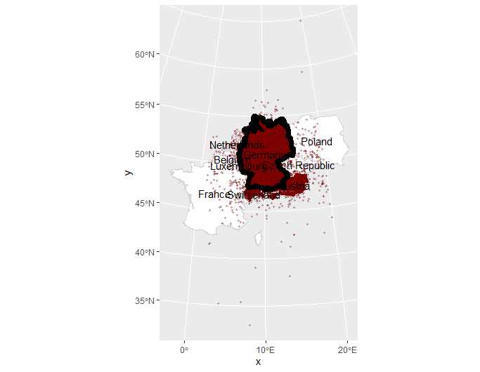
We only only want points for Germany. But before cropping, we draw a 10km buffer around Germany, to include some points just outside Germany. Otherwise, interpolations close to the German border would look weird.
# Buffer
  # Create a buffer around German border
  # so interpolation of linguistic data --
  # which extend beyond German border --
  # doesn't look wonky at the edges
    germ_buff <- germany %>%
                  st_buffer(dist = 10000)
# Crop (find intersection of two data layers)
  # Crop responses to Germany + buffer
    germ_resp <-
      responses %>%
        st_intersection(germ_buff)
Make Regular Grid
Interpolation begins with creating a grid, in which the algorithm predicts the value of cells without a given value from nearby cells that do have values.
In GIS-speak, this would be interpolating a discrete geometric point data set to a continuous surface, represented by a regular grid (a “raster” in geoscience terms).
We use st_make_grid from the sf package, which takes an sf object like germany_buffered and creates a grid with a certain cellsize (in meters) over the extent of that sf object.
We also define the number of cells in each dimension (n).
Timo found the ideal cell width is 300, but we use 100 here for expediency (nearly quadratic increase in processor time as cell number increases).
The height of the grid in pixels is computed from the width (because that depends on the aspect ratio of Germany).
# Create grid
#
# Define parameters:
  width_in_pixels = 100 # 300 is better but slower
  # dx is the width of a grid cell in meters
    dx <- ceiling( (st_bbox(germ_buff)["xmax"] -
                    st_bbox(germ_buff)["xmin"]) / width_in_pixels)
  # dy is the height of a grid cell in meters
  # because we use quadratic grid cells, dx == dy
  dy = dx
  # calculate the height in pixels of the resulting grid
  height_in_pixels <- floor( (st_bbox(germ_buff)["ymax"] -
                              st_bbox(germ_buff)["ymin"]) / dy)
# Make the grid
  grid <- st_make_grid(germ_buff,
                       cellsize = dx,
                       n = c(width_in_pixels, height_in_pixels),
                       what = "centers")
Prepare input data
First, convert the geometric point data set back to a regular data
frame (tibble), where lon and lat are nothing more than numeric values without any geographical meaning.
We also use dplyr to only retain the 8 most prominent
dialects in the 150k point data set.
Why? Because plotting more than 8 different colors in the final map is a pain for the eyes – the different areas couldn’t be distinguished anymore.
But bear in mind: The more we summarize the data set, the more local specialities we lose (endemic dialects that only appear in one city, for instance).
# Prepare data for interpolation
  # Create tibble of the German responses sf object
    dialects_input <- germ_resp %>%
                    tibble(dialect = .$pronunciation_id,
                             lon = st_coordinates(.)[, 1],
                             lat = st_coordinates(.)[, 2]) %>%
                      select(dialect, lon, lat)
  # Pare to 8 most prominent dialects
    dialects_input <-
      dialects_input %>%
        group_by(dialect) %>%
        nest() %>%
        mutate(num = map_int(data, nrow)) %>%
        arrange(desc(num)) %>%
        slice(1:8) %>%
        unnest(cols=c(data)) %>%
        select(-num)
Run KNN interpolation procedure
We use the kknn function from the same-named package to interpolate from the input point data,
dialects_input, to the empty grid dialects_output.
The function kknn takes these two data frames and a formula dialect . ~; it interpolates the dialect variable according to the other variables, lng and lat.
kknn takes k as the last parameter: it specifies from how many neighboring points (from the point data set) a grid cell will be interpolated.
The bigger this value, the “smoother” the resulting surface will be, the more local details vanish.
What’s special about kknn is that it can interpolate categorical variables like the factor at hand here. Usually with spatial interpolation, KNN is used to interpolate continuous variables like temperatures from point measurements.
Timo describes how he used parallel processing to reduce computing time when doing the fine-grain analysis for his final project, ad includes script in his original post. We’re cutting straight through with a coarse-grain analysis. I’ve also included script that pulls out every fifth row so we only chug 20% of Timo’s data. The run time on my machine was approximately 30 seconds.
After dialects_result is computed for each grid section, it contains the probability for each dialect at each grid cell.
So the script includes the apply function to only retain the most probable dialect at each cell.
  # Thin the dataset
    # The example dataset is huge.
    # Use this script to 'thin' the data
    # and reduce processing time
      dialects_thin <-
        dialects_input %>%
          filter(row_number() %% 5 == 1) # Pull out every 5th row

# Interpolation function
  # define "k" for k-nearest-neighbour-interpolation
    knn = 1000

    # create empty result data frame
    dialects_output <- data.frame(dialect = as.factor(NA),
                              lon = st_coordinates(grid_input)[, 1],
                              lat = st_coordinates(grid_input)[, 2])
    # run KKNN interpolation function
    dialects_kknn <- kknn::kknn(dialect ~ .,
                               train = dialects_thin,
                               test = dialects_output,
                               kernel = "gaussian",
                               k = knn)
    # Extract results to output tibble
      dialects_output <-
        dialects_output %>%
          mutate(dialect = fitted(dialects_kknn),
                 # only retain the probability of the interpolated variable,
                 prob = apply(dialects_kknn$prob,
                              1,
                              function(x) max(x)))
After the interpolation is complete, dialects_output is
transformed into a sf object and the data from the raster grid are be clipped to the boundaries Germany.
  # Transform interpolation tibble to sf
    dialects_raster <- st_as_sf(dialects_output,
                                coords = c("lon", "lat"),
                                crs = crs_etrs,
                                remove = F)
  # Crop to Germany
    germ_rast <-
      dialects_raster %>%
        st_intersection(germany)
Visualize
The basic rasterized data:
  # Basic view of rasterized data
    ggplot() +
      geom_raster(data=germ_rast,
                  aes(x=lon, y=lat,
fill=dialect)) 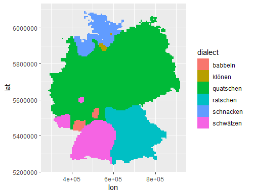
Depth of color represents the probability that a given cell uses that dialect (using alpha argument):
  # Condition density by probability
    ggplot() +
      geom_raster(data=germ_rast,
                  aes(x=lon, y=lat,
                      fill=dialect))

And the final product:
  # Pretty map
    ggplot() + theme_minimal() +
      geom_sf(data=germany, fill="white") +
      geom_raster(data=germ_rast,
                  aes(x=lon, y=lat,
                      fill=dialect,
                      alpha=prob)) +
      geom_sf(data=german_st, fill=NA, color="white") +
      geom_sf(data=germany, fill=NA, color="black") +
      scale_alpha_continuous(guide="none") +
      scale_fill_viridis_d("German dialects of\nverb 'to chatter' ") +
      theme(axis.title = element_blank())
Summarize data
Create a table of dominant dialect per state, and report the frequency of use.
    germ_rast %>%
      st_join(german_st) %>%
      as_tibble %>%
      filter(prob >= 0.1) %>%
        select(dialect, name_en) %>%
          group_by(name_en, dialect) %>%
          summarize(n = n()) %>%
          mutate(freq = n / sum(n)*100) %>%
          arrange(desc(freq)) %>%
          slice(1)
Original blog post and tutorial on how to spatially interpolate such a map with R’s ggplot2 and kknn packages and some parallel processing. Instructions on how to use this can be found there.