Set-up
Here are some things you should do to make working through this course as easy and productive as possible:
- Install the necessary software
- Required: The R Statistical Environment
- R studio is optional but highly encouraged because all the course materials assume one is using it and honestly, I don’t know how I’d do the homeworks without it.
- Truly optional: A \(\LaTeX\) installation, if you want to knit \({\bf\textsf{R}}\) markdown output directly to
.pdffiles. Use MikTeX for Windows, and maybe TexLive for Mac/Unix
- Set up a local \({\bf\textsf{R}}\) directory on the computer you’ll be using for this course. When this class was in-person on-campus, I encouraged folks to have a dedicated USB thumbdrive. You should have a high-level folder for the class called \({\bf\textsf{R}}\), say on your desktop, with the following folder structure:
R
│
└─── data
│
└─── script- Alternatively, fork the course project on GitHub – download course material to your machine and stay up-to-date with any changes.
Get-to-know-you survey
If you’ve ever taken a non-\({\bf\textsf{R}}\) class with me before, you know I’m a sucker for the awkward icebreaker game on the first day of class.
\({\bf\textsf{R}}\) classes are different. We need not only to get introduced to each other, but to get introduced to \({\bf\textsf{R}}\), as well. As a means of demonstrating the functionality of and some of the things we’ll learn in this course, we’ll analyze the survey data that you should have already filled out (the link is on Blackboard to ensure only enrolled students are filling my form up with information).
Getting started
Script
To process the survey data, download the script, survey_analysis.R, into your R > script folder and open it in R studio.
Ensure that the file is saved with the .R extension, not .txt:

There’s no real way to babystep our way into \({\bf\textsf{R}}\); we just need to try and use it. In this course, the commands we need to give \({\bf\textsf{R}}\) are organized into what are often called code chunks–little paragraphs of script that perform a few related operations. This structure supports how you will complete homework assignments and reflects the way the lessons on the blog are laid out.
The script file for this lesson identifies code chunks by commented lines like so:
# START Code Chunk X

# END Code Chunk X
These correspond to chunks in the blog post below, as a way to help you keep your bearings between the script in your R studio window and the material in the blog post and video. Future script will not identify chunks by numbers.
Loading packages
To demonstrate its full functionality, we need to load several external packages that provide additional functions beyond those that come with the basic installation. We’ll cover this more soon, but for now, just run these lines in the \({\bf\textsf{R}}\) console:
# Chunk 1
#
  if (!require("pacman")) install.packages("pacman")
  pacman::p_load(tidyverse, grid, gridExtra,
                 maps, ggmap, maptools,
                 tm, SnowballC, wordcloud)
Loading data
Data are on GitHub. There are two options: the current/most recent term, or all data from all my \({\bf\textsf{R}}\) classes. For the purposes of getting to know your (virtual) classmates, I suggest going with the current version.
# Chunk 2
#
# Current (or most recent) term only:
  survey.d <- read.csv(url("https://raw.githubusercontent.com/devanmcg/IntroRangeR/master/data/SurveyResponsesMostRecent.csv"))
# Data from all-time:
  survey.d <- read.csv(url("https://raw.githubusercontent.com/devanmcg/IntroRangeR/master/data/SurveyResponsesAll.csv"))
Make sure you just run one! If you run both, you’ll end up with just the last one.
# Clean up a bit
  survey.d <- filter(survey.d, !is.na(program ))
Graphing
One of the main reasons folks switch over to \({\bf\textsf{R}}\) is its superior graphics capabilities. We’ll make a few graphs here, using the revered graphics package ggplot2.
Basic bar graphs
The first two products of Chunk 3 are a couple of basic bar graphs:
# Chunk 3
#
  (degree.gg <-
     ggplot(survey.d,
            aes(x=reorder(degree,degree,
                           function(x)-length(x)))) +
    geom_bar() +
      labs(x = "Degree type",
           y = "Number of students") +
      theme_bw(16) +
      theme(axis.text=element_text(color="black"),
            axis.title=element_text(face="bold"),
            panel.grid.major.x  = element_blank(),
            legend.position = "none") )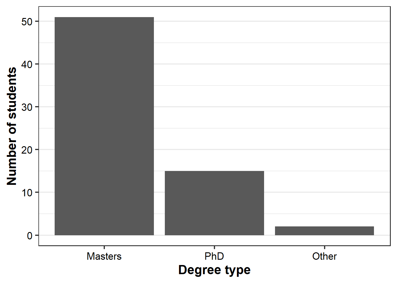
  (program.gg <-
     ggplot(survey.d,
            aes(x=reorder(program,program,
                           function(x)-length(x)))) +
    geom_bar() +
      labs(x = "Program",
           y = "Number of students") +
      theme_bw(16) +
      theme(axis.text=element_text(color="black"),
            axis.text.x = element_text(angle = 33,
                                       hjust = 1),
            axis.title=element_text(face="bold"),
            panel.grid.major.x  = element_blank(),
legend.position = "none") ) 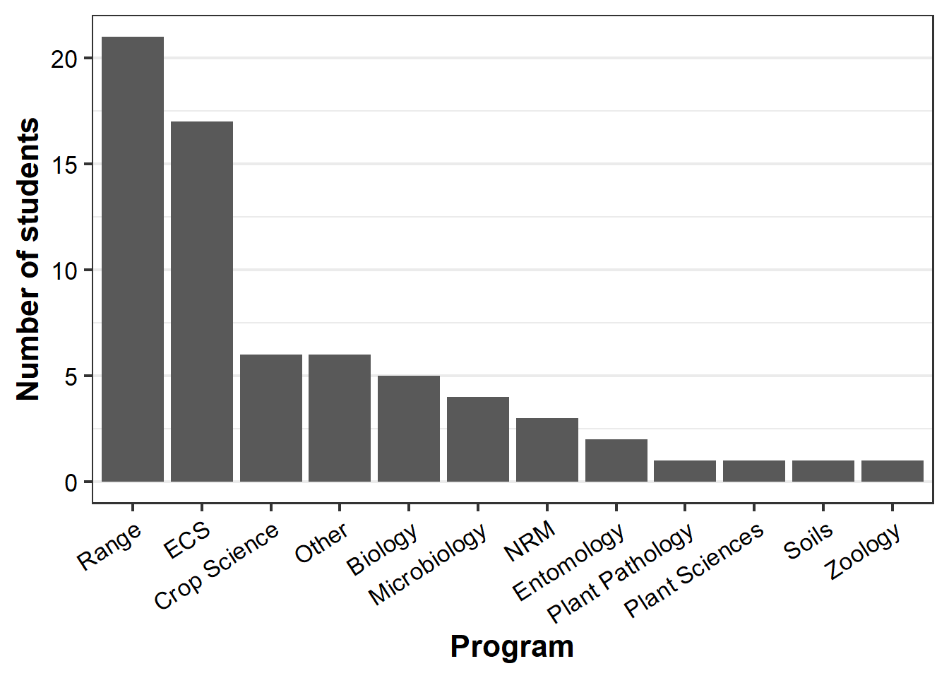
The last line of Chunk 3 simply plots the two graphs side-by-side:
grid.arrange(degree.gg, program.gg, ncol=2)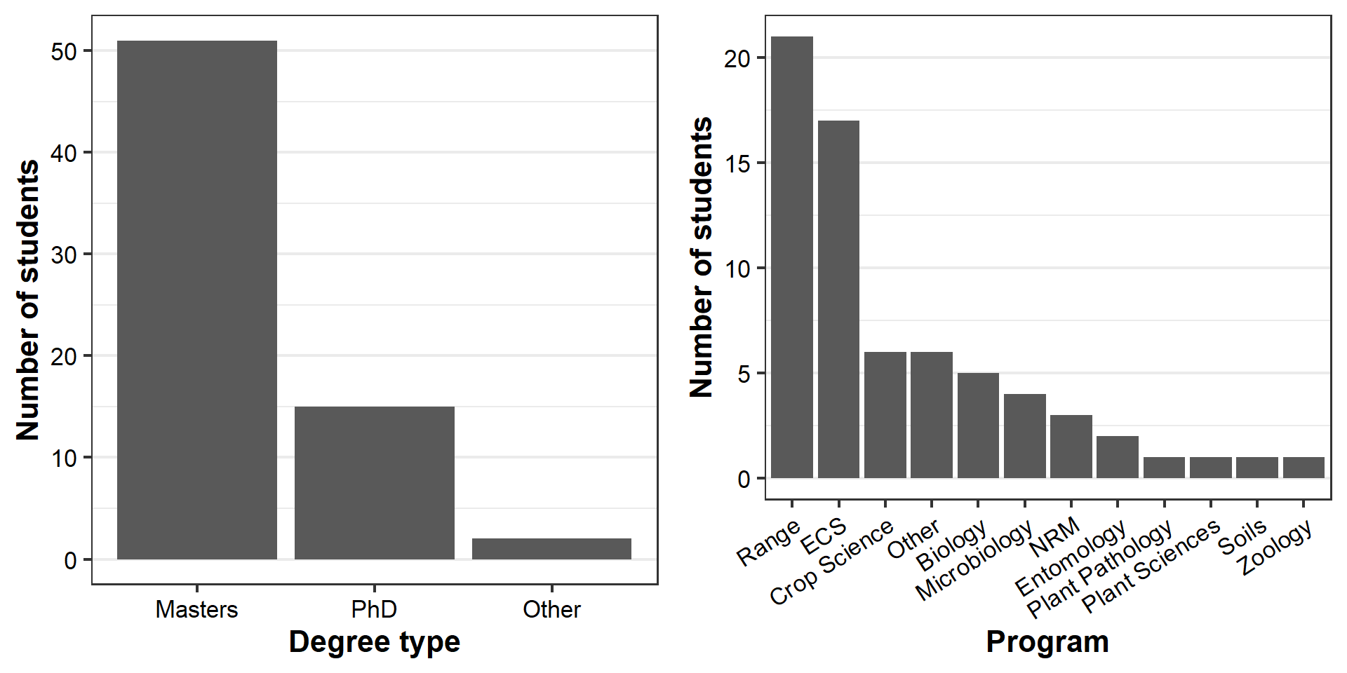
Each graph displays interesting information about two variables that describe students in the class. But why do we need two graphs, with just one set of information each, when they are stored in the same dataset?
Stacked bar graphs
Good graph design seeks to maximize the amount of information conveyed with the simplest graph possible, i.e. data:ink ratio.
ggplot allows us to increase the amount of information in a plot by adding additional variables via aesthetics, which are given as arguments in aes().
Here, we identify degree types per program by assigning the variable degree to aes(fill=) in the geom_bar command, which was empty before:
# Chunk 4
#
  ggplot(survey.d, aes(x=reorder(program,program,
                                 function(x)-length(x)))) +
    geom_bar(aes(fill=degree)) +
    labs(x = "Program", y = "Number of students") +
    scale_fill_brewer(palette = "Set1", name="Degree") +
    theme_bw(16) +
    theme(axis.text=element_text(color="black"),
          axis.text.x = element_text(angle = 33,
                                     hjust = 1),
          axis.title=element_text(face="bold"),
          legend.key.width= unit(1, "cm"),
          legend.text=element_text(size=12),
          legend.title=element_text(size=12,
                                    face="bold"),
          panel.grid.major.x  = element_blank(),
          legend.position = "top")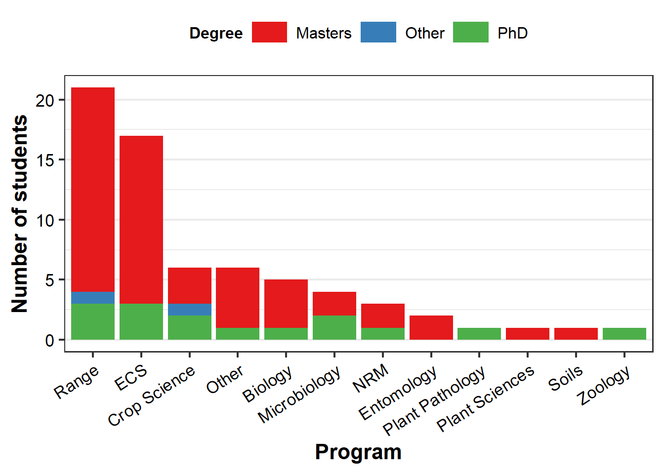
To reinforce the point, let’s just make another bar graph:
# Chunk 5
#
  ggplot(survey.d, aes(x=reorder(water,water,
                                 function(x)-length(x)),
                      fill=factor(degree))) +
    geom_bar() +
    labs(x = "Which implies greater water content?",
         y = "Number of students") +
    scale_fill_brewer(palette = "Set1", name="Program") +
    theme_bw(18) +
    theme(axis.text=element_text(color="black"),
          axis.title=element_text(face="bold"),
          legend.title=element_text(face="bold"),
          panel.grid.major.x  = element_blank(),
          legend.position = "top")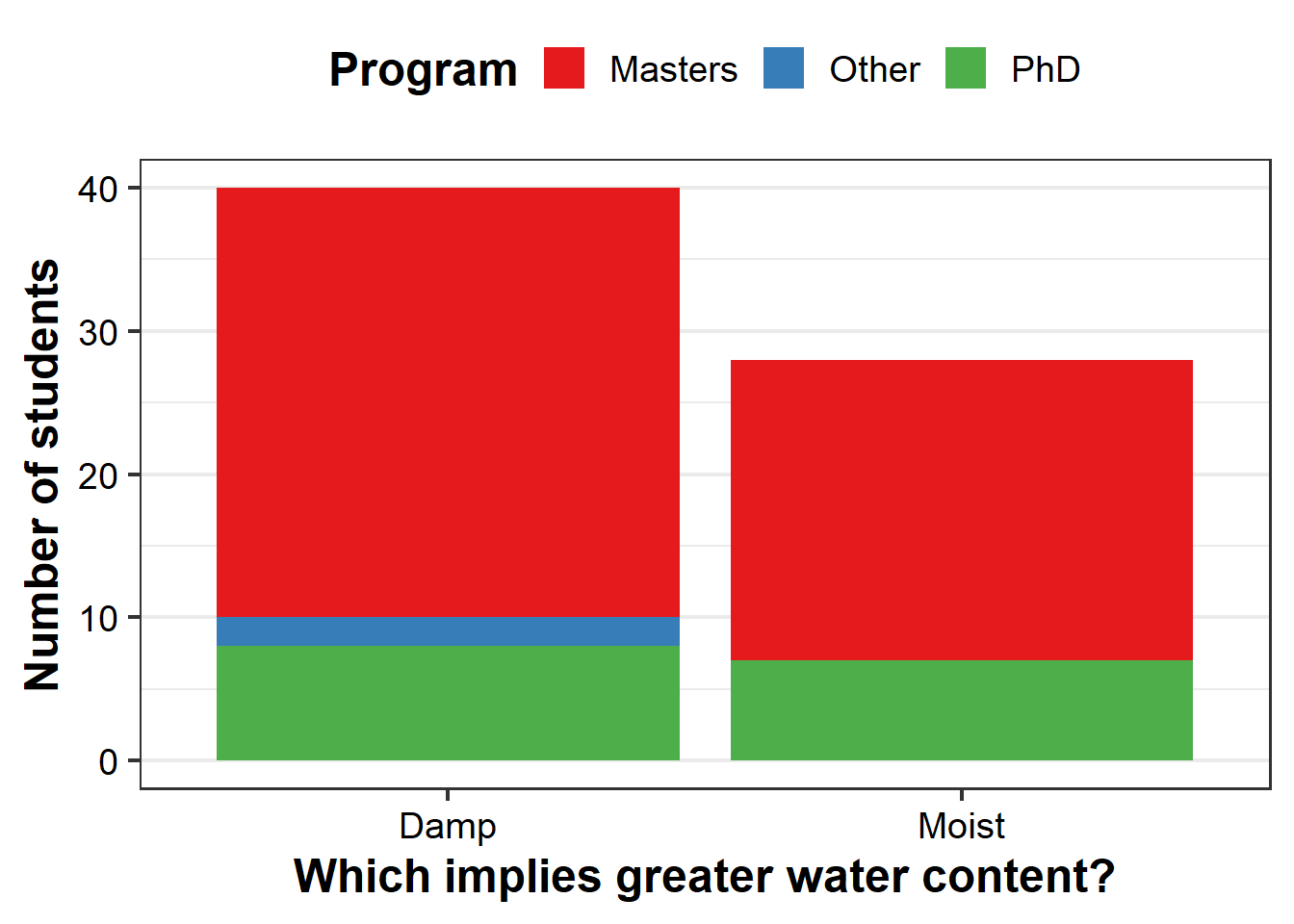
Mapping
You might not have considered this, but \({\bf\textsf{R}}\) can function as a Geographic Information System, or GIS, providing a great free solution to commercial GIS programs. To demonstrate, let’s make maps of where everyone did their undergrad degrees.
First we fetch some map data, and use ggplot to make a map (after all, geographic data are really just \(X,Y\) data like we use to make graphs):
# Chunk 6
#
  world.md <- map_data("world") %>%
                filter(region !="Antarctica")
  l48.md <- map_data("state")

#
  (us.gg <-
   ggplot() + coord_map("polyconic") + theme_minimal(16) +
    geom_polygon(data=l48.md,
                 aes(x=long,
                     y=lat,
                     group=group),
                 color="white",
                 fill="grey90",
                 size=0.25) +
    stat_sum(data=survey.d %>%
                    filter(country == "US"),
             aes(x=long,
                 y=lat,
                 size=factor(..n..),
                 fill=degree),
             geom = "point",
             pch=24,
             col="black")  +
    scale_size_discrete(range = c(2, 6), guide=F) +
    theme(legend.position = "bottom") +
    labs(x="longitude",
         y="latitude",
         title = "Where we did our undergrad") )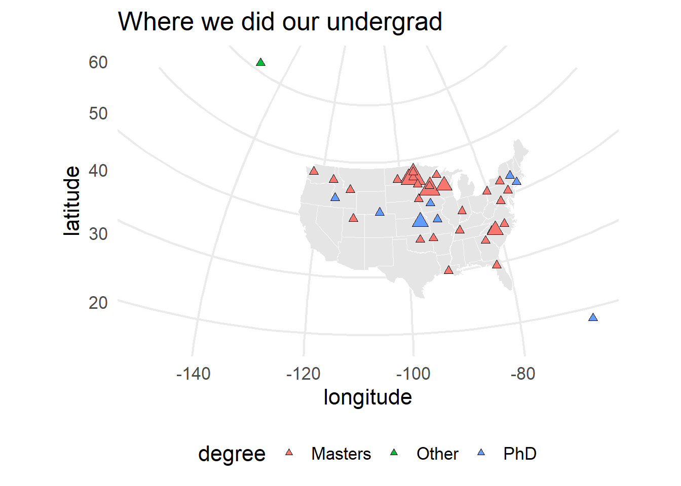
Notice the information that is included here beyond just location: the color and size of the points correspond to students’ current degree type and are scaled by the number of students who did their undergraduate in a given town, using aes(fill=) and size=, respectively.
Some political issues have permeated our little exercise.
In fall 2020, a student who did their undergraduate degree in Puerto Rico enrolled in the course and identifed as having done their degree in the US.
But the GeoNames database entry for Puerto Rico identifies it as a “dependent political entity” and gives PR its own country code.
The script I use to gather longitude and latitude1 for those who did their degrees in the US vs abroad is built around the GNsearch() function, which connects to the GeoNames API.
I modified my script to associate PR with the US as the student initially identified by having GNsearch() match country codes c('US', 'PR').
Should another student in the future identify Puerto Rico as not in the US, the script should still respect that (but we’ll see).
After all that, the underlying map is still CONUS.
We must not leave out Alaska and Puerto Rico, which are stored in the world.md object:
# Chunk 7
#
ak.md <- world.md %>% filter(region == "USA",
                             subregion == "Alaska",
                             long <= -120,
                             lat >= 50)
pr.md <- world.md %>% filter(region == "Puerto Rico")

us.gg + geom_path(data=ak.md,
                  aes(x=long, y=lat,
                      group=group),
                      color="black",
                  size=0.25)  +
        geom_path(data=pr.md,
                  aes(x=long, y=lat,
                      group=group),
                      color="black",
size=0.25) 
Equally important is getting all of our international colleagues on the map, too:
 ggplot() +coord_quickmap( ) +
  theme_minimal(16) +
   geom_polygon(data=world.md,
                aes(x=long, y=lat,
                    group=group),
                color="white",
                fill="grey90",
                size=0.25) +
   stat_sum(data=survey.d,
            aes(x=long, y=lat,
                size=factor(..n..),
                fill=degree),
            geom = "point",
            pch=24, col="black")  +
   scale_size_discrete(range = c(2, 6), guide=F) +
   theme(legend.position = "bottom") +
   labs(x="longitude",
        y="latitude",
        title="Where we ALL did our undergrad")
Word clouds
Finally, \({\bf\textsf{R}}\) offers functionality to handle qualitative data and text strings (not just numbers).
As an example, here’s a word cloud of students’ associations with data and data analysis:
# Chunk 9
#
datCorpus <- Corpus(VectorSource(survey.d$relationship))
datCorpus <- tm_map(datCorpus,
                    removeWords,
                    stopwords('english'))
wordcloud(datCorpus$content,
          scale=c(4,0.5),
          min.freq=1,
          max.words=Inf,
          random.order=FALSE,
          random.color=TRUE)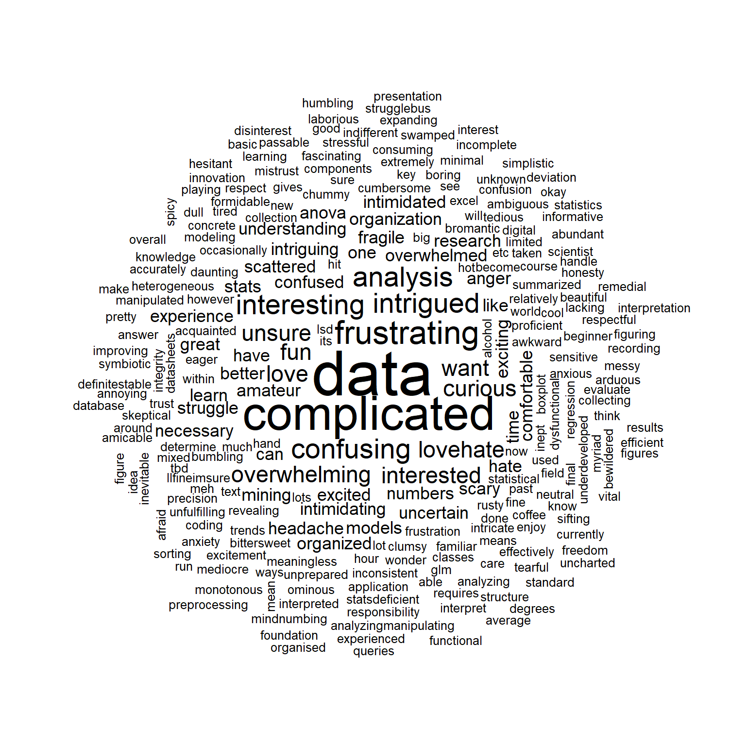
Remember: No one expects you to know how any of that actually worked!
This was just a demonstration of what one can do with \({\bf\textsf{R}}\). But by the end of this course, you will be able to do all of this and lots more.
I’m not sharing this right now because it includes some personal information to log into the GeoNames API via the geonames package, but maybe I’ll get a scrubbed version up sometime. An older example I wrote is available here.↩