Overview
An essential first step before conducting statistical analysis of data – even before deciding which statistical analysis to conduct – is understanding the distribution of those data. It is critical to first understand the type of data, and then the distribution of those data, before selecting a statistical model to ensure that an appropriate test is performed.
This lesson demonstrates how using data distributions to select an appropriate model is not just pedantic nerdiness. Often, fitting a specific model will lead to better outcomes than sticking to standard statistical tests.
The nuts and bolts of distributions and model assumptions are beyond the scope of this Intro course, but I’ve written about it elsewhere.
Objectives
- Review use of
ggplotelements to present data distributionsgeom_histogramgeom_densitystat_function
- Use
MASS::fitdistr()to estimate distribution parameters for the Gamma distribution - Apply distribution functions
d*distandr*distfor the Gamma distributions - Use
quantile()to calculate confidence intervals from simulated datasets
Walking through the script
pacman::p_load(tidyverse)Alternative distributions
When transformations are either not desired or not effective in getting data to fit a normal distribution, an alterative is to use a statistical model that assumes the data fit a different distribution.
Generalized linear models are examples of regression models in which the distribution is specified.
One determines the most appropriate distribution via the same steps as above, using MASS::fitdistr() and d*dist and r*dist distribution functions.
The gamma distribution is often a good alternative for skewed data.1 The following example demonstrates the utility of the gamma distribution over the normal distribution, even though the latter would technically work with these data.
These data come from a paper on raptor responses to prescribed fire. We can load them directly from the course GitHub site:
load(url("https://github.com/devanmcg/IntroRangeR/raw/master/data/swha.dat.Rdata"))
(swha <- as_tibble(swha.dat) )
## # A tibble: 18 x 7
## burn year species pre.count dur.count sum diff
## <int> <int> <fct> <dbl> <dbl> <dbl> <dbl>
## 1 6 2014 SWHA 0 18 18 18
## 2 7 2014 SWHA 0 11 11 11
## 3 8 2014 SWHA 0 19 19 19
## 4 9 2014 SWHA 0 8 8 8
## 5 10 2014 SWHA 0 43 43 43
## 6 11 2014 SWHA 1 16 17 15
## 7 14 2015 SWHA 0 6 6 6
## 8 15 2015 SWHA 0 15 15 15
## 9 16 2015 SWHA 0 7 7 7
## 10 17 2015 SWHA 0 9 9 9
## 11 18 2015 SWHA 0 44 44 44
## 12 19 2015 SWHA 0 39 39 39
## 13 20 2015 SWHA 0 16 16 16
## 14 21 2015 SWHA 4 51 55 47
## 15 22 2015 SWHA 0 10 10 10
## 16 23 2015 SWHA 0 7 7 7
## 17 24 2015 SWHA 4 12 16 8
## 18 25 2015 SWHA 3 3 6 0The hypothesis was that raptors were attracted to fires, so observers counted the number of raptors before and during burns.
The only species that demonstrated an effect was Swainson’s Hawk, so the data are trimmed to SWHA.
The analysis focused on the change in counts, during - before, represented by the variable diff:
swha_gg <- ggplot(swha, aes(x=diff)) + theme_bw(16) +
            geom_histogram(aes(y=..density..),
                           binwidth=1,
                           colour="black",
                           fill="lightgreen") +
            geom_density(alpha=.2, fill="#FF6666")
swha_gg 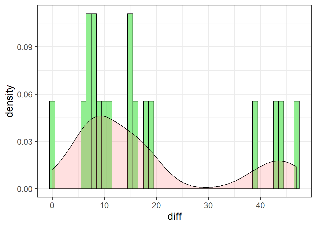
These data are definitely not normally distributed. There are several cases of very high differences. All data are either positive, or zero (no effect).
Let’s add the theoretical normal distribution, and see if the log-normal does any better:
swha_gg +
  stat_function(data=swha,
                fun = dnorm,
                args=list(mean=mean(swha$diff),
                          sd=sd(swha$diff)),
                colour="blue",
                size=1.1)  +
  xlim(c(-30, 60))  +
  stat_function(data=swha,
                fun = dlnorm,
                args=list(meanlog=mean(log(swha$diff+1)),
                          sdlog=sd(log(swha$diff+1))),
                colour="blue",
                lty=5,
                size=1.1)  +
  labs(title = "Normal (Gaussian) & log-normal")
The normal distribution (solid line) is a poor fit for two main reasons:
- It under-predicts every value
- It over-predicts negative values, of which there are none in the actual data
The log-normal does better: it doesn’t predict any negative values and is decent at catching the peak between 0 and 10.
We can also explore a gamma distribution.
Just putting in these data as they are will cause fitdistr to return an error, as the support for the gamma distribution – the range of potential values – is positive non-zero (\(x > 0\)); \(x \le 0\) is not allowed.
These data include zero, but we can circumvent the limitation by adding a trivial positive non-zero value, 0.001:2
MASS::fitdistr(swha$diff+0.001, "Gamma")## shape rate
## 0.81921940 0.04579237
## (0.23607979) (0.01778030)The parameters for the gamma distribution, shape and rate, are calculated from the mean and standard deviation.
The parameter list is passed to dgamma via args=:
swha_gg + stat_function(data=swha,
                        fun = dgamma,
                        args=list(shape=1.86,
                                  rate=0.101),
                        colour="darkred",
                        size=1.1) +
  stat_function(data=swha,
                fun = dlnorm,
                args=list(meanlog=mean(log(swha$diff+1)),
                          sdlog=sd(log(swha$diff+1))),
                colour="blue",
                lty=5,
                size=1.1)  +
  xlim(c(-1, 60)) +
  labs(title = "Gamma + log-normal distribution")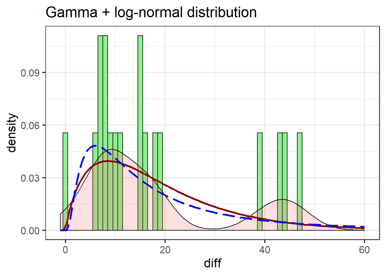
The gamma distribution isn’t terribly different from the log-normal, but notable improvements include the gamma more closely matching the first peak in the density estimate, and better estimating post-peak values.
Using r*dist functions
Having robust parameter estimates for data distribution is a powerful tool. For instance, once we know what the data ought to look like, we can generate many more observations than what we were limited to collecting from the field. These simulated data can be used in statistical models.
Confidence intervals
Confidence intervals are a basic statistical model we can apply to simulated data. Consider that the SWHA data are differences between before-fire and during-fire counts:
- If there is an effect, it means the the difference is significantly different from zero.
- Thus, at \(P = 0.05\), 95% of the time, the data should not include zero
This defines the 95% confidence interval – the range between which a random datapoint will occur at least 95% of the time.
We can simulate n number of observations from a specific distribution using r*dist functions:
swha_dist <-
  tibble( Normal =
            rnorm(
              n=1000,
              mean=mean(swha$diff),
              sd=sd(swha$diff)),
          LogNormal =
             rlnorm(
               n = 1000,
               meanlog=mean(log(swha$diff+1)),
               sdlog=sd(log(swha$diff+1))),
          Gamma =
            rgamma(
              n=1000,
              shape=1.86,
              rate=0.101 ) ) %>%
  pivot_longer(everything()) %>%
  rename(dist = name)
swha_dist
## # A tibble: 3,000 x 2
## dist value
## <chr> <dbl>
## 1 Normal -4.13
## 2 LogNormal 15.7
## 3 Gamma 25.1
## 4 Normal 3.87
## 5 LogNormal 43.4
## 6 Gamma 10.5
## 7 Normal 15.9
## 8 LogNormal 15.0
## 9 Gamma 8.63
## 10 Normal 32.1
## # … with 2,990 more rowsThe simulated data can be interpreted as if we were able to go count Swainson’s Hawks 1000 times under three different scenarios: Their responses to fire followed a normal, log-normal, or gamma distribution.
From these data we calculate 95% confidence intervals to determine where observations are most likely to occur under each scenario.
Confidence intervals are found via the quantile() function, which finds the value in a vector at each position identified in the prob= argument.
In this case, we want to essentially trim the lowest 2.5% and 97.5% of the data, to focus on the center 95%:
 swha_dist %>%
  group_by(dist) %>%
    summarize(`2.5%` = round(quantile(value,
                                      prob=0.025,
                                      na.rm=TRUE),
                             0),
              `97.5%` = round(quantile(value,
                                       prob=0.975,
                                       na.rm=TRUE),
                              0))
## # A tibble: 3 x 3
## dist `2.5%` `97.5%`
## <chr> <dbl> <dbl>
## 1 Gamma 2 51
## 2 LogNormal 2 79
## 3 Normal -11 47Recall that a confidence interval that includes zero indicates that the data are not significantly different from zero, which in this case means there is no effect of fire attracting Swainson’s Hawks.
We can visualize the distributions of simulated data with respect to zero:
swha_dist %>%
  ggplot() + theme_bw(16) +
    geom_hline(yintercept = 0,
               size=1.5,
               lty=2) +
    geom_violin(aes(x=dist,
                    y=value,
                    fill=dist),
                alpha=0.75,
                show.legend = F) +
    coord_flip() +
  geom_violin(data=swha,
              aes(x=1.5, y=diff),
              fill=NA, size=1.5) +
   geom_jitter(data=swha,
               aes(x=1.5, y=diff),
               width = 0.1,
               size=4,
               pch=21, stroke=1.5,
               col="grey80", bg="grey20") +
   annotate("text", x=1.5, y=100,
            label="Actual data",
            size=6,
            fontface="bold")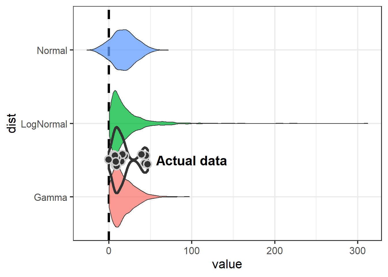
Note use of geom_hline, coord_flip, and annotate to improve presentation in the plot.
The take-away is that if we model Swainson’s Hawk response with a normal distribution, we aren’t going to detect an effect.
Because the normal distribution is symetrical and the mean of our data is close to zero, the normal distribution is going to include some negative numbers even though we never saw a negative number in our dataset. Both the log-normal and gamma distributions show an effect (neither 95% CI includes zero), but the gamma is preferable because it is less likely to over-estimate at the high end (51 vs 88).
The upshot of this example is that by using an alternative distribution, an effect was demonstrated for at least one species and the paper got published. But I have mixed feelings about whether this was the right approach.