Overview
An essential first step before conducting statistical analysis of data – even before deciding which statistical analysis to conduct – is understanding the distribution of those data.
Many statistical models have one or more assumptions about the nature of the data being tested, and several assumptions refer to the distribution. Importantly, not all models have the same assumptions, or even apply to the same types of data. Thus it is critical to first understand the type of data, and then the distribution of those data, before selecting a statistical model to ensure that an appropriate test is performed.
This lesson shows how to find data moments and plot distributions with ggplot.
The nuts and bolts of distributions and model assumptions are beyond the scope of this Intro course, but I’ve written about it elsewhere.
Objectives
- Use
ggplotto present data distributions usinggeom_histogramgeom_densitystat_function
- Use
MASS::fitdistr()to estimate distribution parameters - Apply the distribution function
d*distfor normal and log-normal distributions
Walking through the script
Load packages.
permute has an example dataset we’ll play with in this lesson, after first converting to a tibble object:
pacman::p_load(tidyverse, permute)
data(jackal)
(jackal <- as_tibble(jackal))
## # A tibble: 20 x 2
## Length Sex
## <dbl> <fct>
## 1 120 Male
## 2 107 Male
## 3 110 Male
## 4 116 Male
## 5 114 Male
## 6 111 Male
## 7 113 Male
## 8 117 Male
## 9 114 Male
## 10 112 Male
## 11 110 Female
## 12 111 Female
## 13 107 Female
## 14 108 Female
## 15 110 Female
## 16 105 Female
## 17 107 Female
## 18 106 Female
## 19 111 Female
## 20 111 FemaleSome basics of statistics
To understand why data distributions are so important to picking a good statistical model, let’s review some of the basic reasons for using statistics in the first place.
A potential research question for these data might include: Does the length of jackal teeth vary by sex?
The typical approach would be to measure the length of male and female jackal teeth and compare the average length of teeth by sex:
jackal %>%
  group_by(Sex) %>%
    summarise(Mean=mean(Length) ) %>%
knitr::kable()| Sex | Mean |
|---|---|
| Male | 113.4 |
| Female | 108.6 |
We can see that the average male jackal has longer teeth than the average female jackal. But this does not necessarily mean that any random male jackal is likely to have longer teeth than any random female jackal, which is more convincing evidence in terms of the initial research question.
To determine how well the average jackal of a particular sex represents any random jackal of that sex, we need to look at the variability of the data around that mean. The closer most jackals of a particular sex are to the mean, the more robust of an estimate the mean represents. But if the individual observations are scattered widely around the mean value, the mean is mostly just an arithmetic value that has little use to us in describing biological patterns.
Variability around the mean can be assessed by standard deviation, which is typically a measure of variability in the broader population (e.g., all the jackals), or the standard error, which can be interpreted as how precisely the mean of a sample represents the mean of the population (e.g., these 10 jackals vs all the jackals out there); if variability in the population is high, it is unlikely that the sample mean overlaps well with the population mean.
jackal %>%
  group_by(Sex) %>%
    summarise(
       Mean = mean(Length),
       SD = sd(Length),
       SE = sd(Length)/sqrt(length(Length))) %>%
  mutate_at(vars(SD, SE), ~round(., 2)) %>%
knitr::kable()| Sex | Mean | SD | SE |
|---|---|---|---|
| Male | 113.4 | 3.72 | 1.18 |
| Female | 108.6 | 2.27 | 0.72 |
Just looking at these tables, though, doesn’t give us much of an idea of how much variability is actually around the mean.
Let’s plot the data:
jackal %>%
  group_by(Sex) %>%
    summarise(
       Mean = mean(Length),
       SE = sd(Length)/sqrt(length(Length))) %>%
  ggplot(aes(x=Sex)) + theme_bw(16) +
    geom_jitter(data=jackal,
                aes(y = Length),
                width = 0.15,
                alpha = 0.5) +
    geom_errorbar(aes(ymin = Mean - SE,
                      ymax = Mean + SE),
                  width = 0.1,
                  size = 1) +
    geom_point(aes(y = Mean),
               pch = 17,
               size = 5)
We already knew the average male jackal had longer teeth than the average female, but this plot illustrates the degree to which observations for each sex overlap. Indeed, several females have longer teeth than several males, and one male even has shorter teeth than the average female.
But the error bars do not overlap, which gives us our first indication that the fact that the average male tooth length is longer than the average female tooth length is a legitimate biological trend in this jackal population.
The next step would be to test this statistically – what is the probability that the pattern in the sample data is due to chance regarding our sampled jackals, rather than a real biological pattern among jackals?1
For a statistical model to give us insight into a population based on a sample, it makes some assumptions about patterns in the population that we probably don’t know, and must infer from our sample data. Thus, if our data don’t match those assumptions, we cannot reliably extend the model’s analysis of our data to the broader population.
If you’ve heard about assumptions before, you’re probably most familiar with the assumption of normality, which means the data are distributed in a bell-shaped curve: most observations are close to the mean, with very few low and high values:
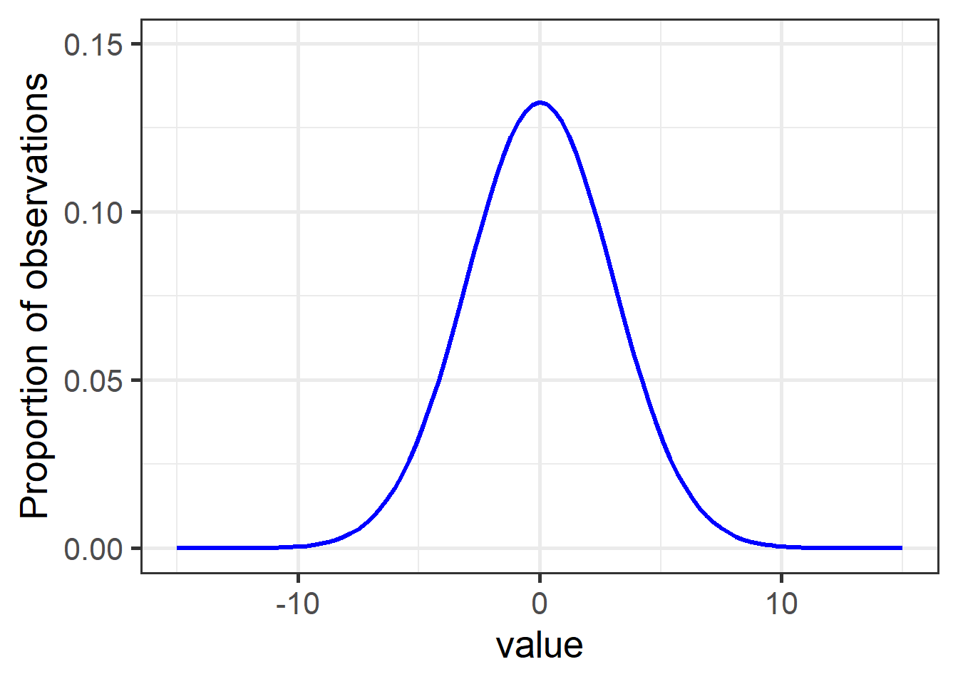
Figure 1: A typical normal (aka Gaussian) distribution with mean = 0 and sd = 3.
Nearly 15% of observations have a value of 0, while values of -5 and below, and 5 and above, comprise less than 5% of observations together (2.5% each).
The general bell curve is the theoretical shape of any normally-distributed population. The specific shape – steepness of slope, sharpness of point – are determined by the variance (here, sd = 3), while the values along the bottom depend on the actual range of the data.
Plotting distributions
Let’s see how our sample data on jackal look in terms of the expected bell curve shape.
There are three components to plotting distributions in ggplot.
Each step connects the data in the sample to the theoretical distribution the model assumes the population must have.
Histogram
We use geom_histogram to plot our actual data from the sample.
It is a bit different than other geoms:
- When
y = ..density..it knows we want to see the data’s distribution, and we only assign one aesthetic from variables in our dataset asx=, which is the specific vector in the dataset we want to see the distribution of. binwidth=is an important argument that can take trial and error to get right. Setbinwidthtoo small, and there will be odd gaps between the bars, or it will take a long time to render the plot. Setbinwidthtoo high, and you won’t see patterns in the data.
jn_gg <- ggplot(jackal, aes(x=Length)) + theme_bw(16) +
              geom_histogram(aes(y=..density..),
                 binwidth=1,
                 colour="black",
                 fill="lightgreen")
jn_gg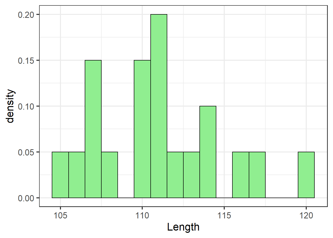
Kernel density estimate
The second step starts to connect patterns in our sample data to what the population might look like.
geom_density smooths the trend of the binned histogram bars using what’s called a kernel density estimate.
If there are gaps in our sample data, the density estimates what the missing values might be, giving a better approximation of the potential distribution of the data had we collected more samples:
jn_gg <- jn_gg + geom_density(alpha=.5, fill="lightblue")
jn_gg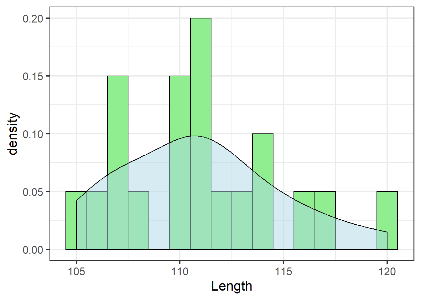
Even though our sample doesn’t include an observation with tooth length 115, the density estimate suggests about 5% of jackals would have tooth length 115 if we had a more complete sample.
Moments
The third step is to take what we know about the distribution of our sample data and estimate the distribution of the population. This is the assumption that the statistical model will make: the population distribution can be described by moments of the data:
- The first moment is the mean
- The second moment is the variance
All theoretical distributions can be described in terms of these two moments: the mean \(\mu\) and the variance \(\sigma^2\). But as we can infer from the density plot, there can be some error in the moments of our sample data and what we’d find if we had a better, or even different, sample.
We can use the fitdistr function from the default MASS library to estimate robust parameters for distributions based on our sample data.2
Just give it the vector and the desired distribution:
MASS::fitdistr(jackal$Length, "normal")## mean sd
## 111.0000000 3.7815341
## ( 0.8455767) ( 0.5979130)The normal distribution uses the raw moments as parameters.3 This represents the theoretical distribution of the population assumed by a test based on the normal distribution.4
We add the theoretical distribution using a new element of ggplot: instead of a geom, we use a stat, specifically stat_function, which chugs a function (defined as fun =) in the background and adds the results to the plot.
\({\bf\textsf{R}}\) has many functions for distributions. All have two parts:
- The first part is either
d,r,p, orq. Right now, we only care aboutd*distandr*dist.drefers to density, and returns the theoretical distribution curve.rstands for random, as in random number, and returns a defined number of random draws from a given distribution.
- The second part (
*dist) defines which distribution to use. In this case, we wantnorm, for the normal distribution.
Putting this together, we assign fun = dnorm for stat_function to give us the theoretical normal distribution.
One last step: Assign the parameters.
Each *dist or *dist function needs to know the parameters of the data.
dnorm needs \(\mu\) and \(\sigma^2\).
Since stat_function is running dnorm in the background and plotting the results, we need stat_function to pass the parameters on to dnorm for us.
This is accomplished with args=.
We give args= a list of arguments that dnorm needs.
stat_function technically doesn’t use these arguments itself, so looking up ?stat_function won’t help figure out what arguments to pass. ?dnorm will.
Remember, we got our parameter estimates from MASS::fitdistr():
jn_gg <- jn_gg +
          stat_function(data=jackal,
                       fun = dnorm,
                       args=list(mean = 111,
                                 sd = 3.78),
                       colour="blue",
                       size=1.1)
jn_gg
The blue line shows the theoretical distribution of the data – the distribution of the population assumed by a statistical model based on the normal distribution.
If the distribution of the sample data do not match this theoretical distribution well, it is inappropriate to use a statistical test that assumes a normal distribution, and results of such a test, even if it runs without an error, are not to be trusted.
Let’s zoom out a bit to get a better idea of the assumed distribution:
jn_gg <- jn_gg + xlim(c(mean(jackal$Length)-15,
                      mean(jackal$Length)+15))
jn_gg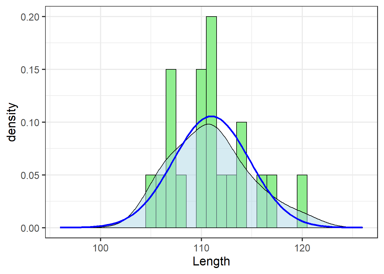
Assessing fit
While it can be difficult to compare the histogram (green bars) and the theoretical distribution (blue line), the density estimate (shaded area) helps.
In this case, the blue line and the shaded area match pretty well. This is a subjective assessment based on one’s own visual analysis of the plot. While there are statistical tests out there one can use to determine whether the data fit the assumed distribution “well enough,” I discourage their use because there are concerns about sensitivity to sample size. Yes, distributions are important. No, we don’t need to get really anal about testing them – visual assessment is fine.
One major source of poor fit is skewness, which refers to an asymetrical distribution visualized as a tail on one side or another of the bell curve.
A quick way to quantify skewness is to calculate the ratio between the mean and the median. Data that follow a perfectly normal distribution will have identical mean and median, with exactly half of the data on each side of the mean:
knitr::kable(
  tibble(Mean = mean(jackal$Length),
         Median = median(jackal$Length),
         Ratio = Mean/Median)
)| Mean | Median | Ratio |
|---|---|---|
| 111 | 111 | 1 |
Deviations beyond 0.95 – 1.05 are worth looking into.
Improving fit
Clearly these data don’t need much work, but we’ll use them to demonstrate some options to correct for skewness.
In general, if data do not match a given distribution, one has two options:5
- Transform the data such that they better fit the distribution
- Fit a different distribution
Transformations
A transformation is a mathematical operation applied to each data point that alters their value and thus changes the shape of the distribution. Importantly, a transformation does not change the relative values of the observations, so a point with a lower value than another in the raw data set will still have a lower value in the transformed data set. However, their values will be changed and they will likely have more or less space between them on the new scale.
In the context of the normal distribution, the log transformation is likely the most frequently-encountered solution to skewness. In the log transformation, each value is essentially reduced by an order of magnitude, so points that occur out on the tail of a skewed distribution are brought closer to the median. As such, the effectiveness of the log transformation is greatest when the original data scale spans at least one order of magnitude, but not so many that dropping one order of magnitude doesn’t have much of an effect.
To view the distribution of log-transformed data in \({\bf\textsf{R}}\), one can either apply the transformation to the data themselves with the log() function…
mutate(jackal, LogLength = log(Length))## # A tibble: 20 x 3
## Length Sex LogLength
## <dbl> <fct> <dbl>
## 1 120 Male 4.79
## 2 107 Male 4.67
## 3 110 Male 4.70
## 4 116 Male 4.75
## 5 114 Male 4.74
## 6 111 Male 4.71
## 7 113 Male 4.73
## 8 117 Male 4.76
## 9 114 Male 4.74
## 10 112 Male 4.72
## 11 110 Female 4.70
## 12 111 Female 4.71
## 13 107 Female 4.67
## 14 108 Female 4.68
## 15 110 Female 4.70
## 16 105 Female 4.65
## 17 107 Female 4.67
## 18 106 Female 4.66
## 19 111 Female 4.71
## 20 111 Female 4.71… or simply use the log-normal distribution:
MASS::fitdistr(jackal$Length, "lognormal")## meanlog sdlog
## 4.708955927 0.033804989
## (0.007559025) (0.005345038)jn_gg +
stat_function(data=jackal,
fun = dlnorm,
args=list(meanlog=4.71,
sdlog=0.03),
lty=5,
colour="blue",
size=1.1) 
Note the use of dlnorm in place of dnorm to fit the log-normal distribution, and the different parameters passed via args=.
dnorm could just as easily be used if the underlying data were first log-transformed, which would require redrawing the plot or some other tricks.
These data didn’t need the transformation (and the solid blue line actually traces the density estimate best), but the effect is apparent: a tighter fit around the mean.
Note that is a fairly colloquial use of the term “probability” and doesn’t actually reflect the logical construction of the statistical test we’d likely apply here.↩
MASS is one of those packages with functions that create conflicts with tidyverse functions, so I recommend not loading it to the session and using necessary functions from it directly with
MASS::.↩For other, not-normal distributions, parameters are calculated from the moments.
fitdistrreturns the parameters for those distributions, not \(\mu\) or \(\sigma^2\).↩A Probability Density Function under which the entire area integrates to 1.0.↩
A third option, using a non-parametric test that doesn’t have assumptions about the distribution, will not be covered here because I neither use nor teach non-parametric tests ¯\_(ツ)_/¯ ↩